Hulu Redesign Case Study:
A redesign of the Hulu TV App navigation system + concept for a new social feature
My team and I wanted to choose something for this project that would be relevant to the strange times we're living in with most of the world sheltering in place. We know that because of the circumstances people are watching TV and using streaming apps more than ever. We thought this would be a good opportunity to not only improve the user experience for people, but find a way to help people use streaming apps as a way to engage and stay connected with their friends and family while social distancing. From asking around, to researching online (as well as personal experience) we began to realize that people have a lot of frustration with Hulu's interface, and that is where our redesign began.
PROJECT INFO
This was a two week long group project at UC Berkeley.
MY ROLE
Research, UX Design, UI Design
YEAR
2020
TOOLS USED
Figma, Miro
Phase 01: empathise
Overview
These days streaming TV has become a part of almost everyone’s life. Most of us have at least one if not more subscriptions to streaming services such as Netflix, Amazon Prime, etc. We wanted to understand users habits and frustrations when interacting and navigating through these services, more specifically Hulu. In 2019, Hulu had over 25 million paying subscribers. They are on their way to being one of the top streaming apps, but for some reason people don't seem to like Hulu as much as other apps so we wanted to dig deep and find out why.
Problem
- Navigation frustrates users
- Accessibility with interface (color & text)
- Poor personalization (doesn't cater to user well)
- Vertical scrolling/organization of content frustrates users
- Users want an easy way to watch with friends and family when they aren't together (during quarantine)
Research
HEURISTIC EVALUATION & USABILITY TESTING
To start getting an understanding of what frustrates users when it comes to using Hulu, we first did a Heuristic Evaluation of the interface as well as conducted 4 usability tests on the existing app. Here are some key insights we discovered:
- The navigation is confusing and it's hard to identify which row is active. The over line on top confused users
- The thin white text disappears into the large poster images making it very difficult to read
- Vertical navigation makes it so the user sees less titles
- The featured content isn't personalized/catered to the user
- Primary options such as "Keep Watching" and "Unwatched" in "My Stuff" is all the way to the right, forcing the user to click several times to get to it
SURVEY & INTERVIEWS
We conducted 5 interviews and collected 52 survey results. Many users complained about the frustrating experience they have while using Hulu, however we found that one of the biggest pain points for users is Hulu’s current navigation, which they said is totally confusing.
We asked users in a survey what their favorite streaming app was:
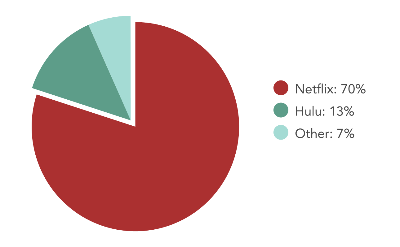
70% of users said that Netflix is their favorite streaming app, so we wanted to find out why and what it is that they are doing that users like so much.
ADDITIONAL QUALITATIVE RESEARCH
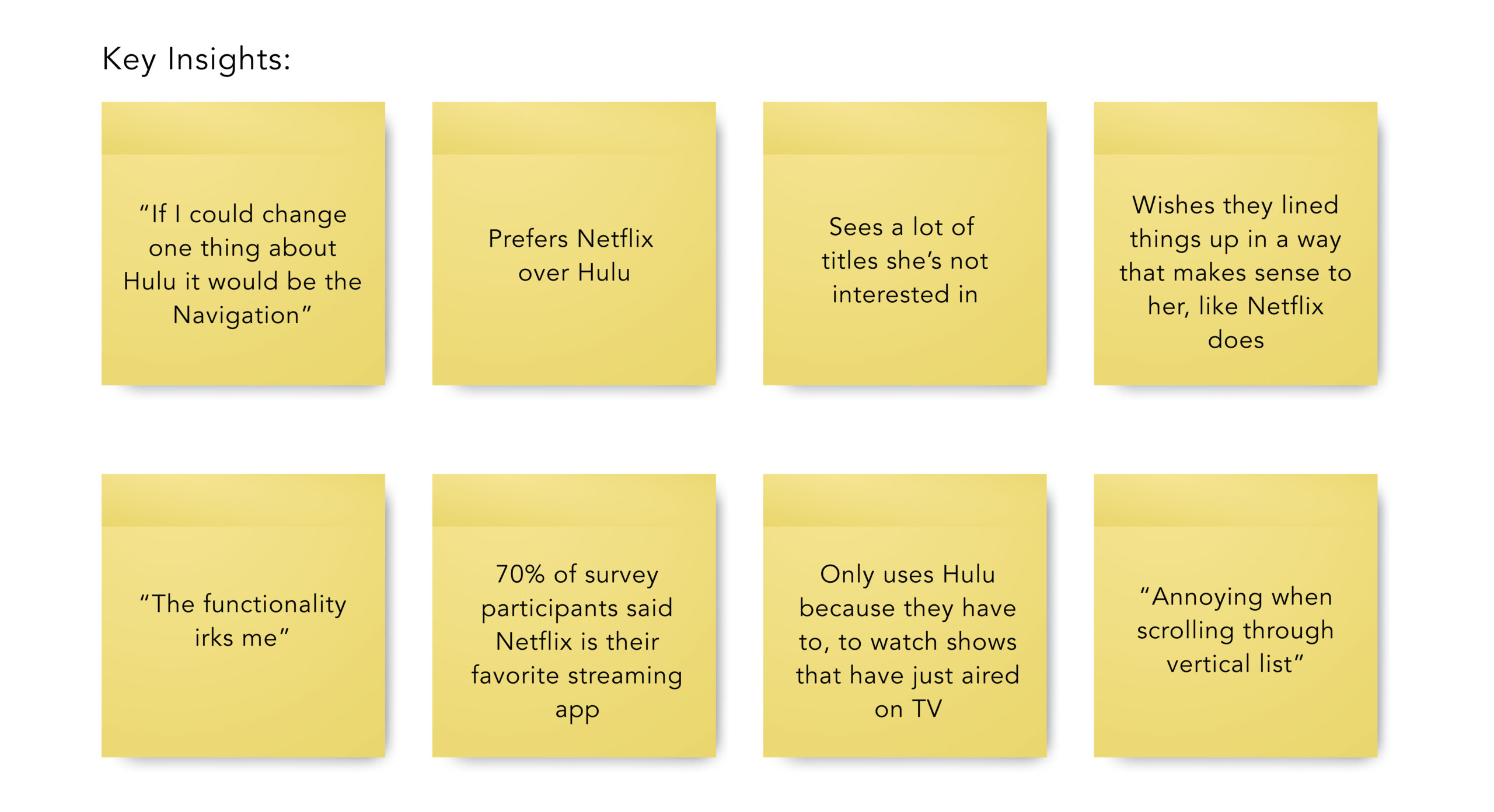
Since Hulu is a pretty well known company and platform we did a lot of online research. We searched through articles and the community thread on Hulu's website and found many comments of people complaining about the interface. Here are just a few of the user quotes we found expressing their frustration:
"I hate the inconsistent 'highlighting' of selections while scrolling through the menus."
"It can be very annoying when scrolling through a vertical list of selections."
"Thinking of cancelling my account, since the new interface makes Hulu unusable."
AFFINITY DIAGRAM
We gained A LOT of insight from our research which created a big affinity diagram. It was almost hard to narrow down the pain points to highlight because there were so many. People had a lot feelings about Hulu and streaming apps. But here are some of the key insights we saw most frequently, felt were most valuable and which led the overall direction of our design decisions:
Phase 02: define
Design goals: to improve user experience while navigating the Hulu TV App, make it more personalized and find a way to help users engage with friends and family while streaming.
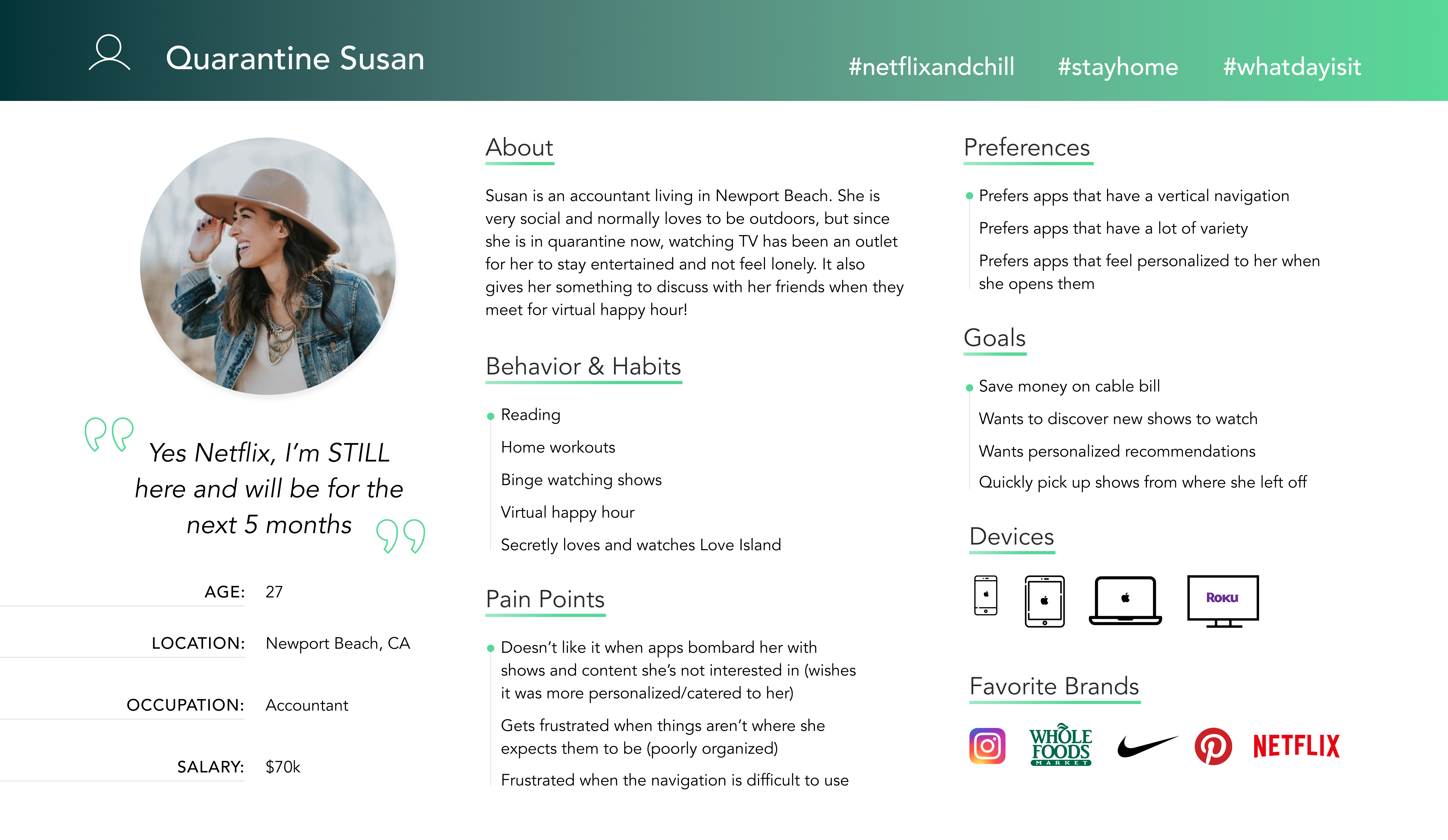
User Persona
After organizing all of the data we obtained from our reseach with an affinity diagram we then had a pretty solid understanding of who we were designing for.
Problem Statement: Hulu users get frustrated when navigating the TV app causing them to have a non-enjoyable user experience and even switch to another streaming app due to lack of personalization and organization.
How might we improve the navigation so users have a more personalized and intuitive streaming experience?
Competitor Analysis
We took a look at 4 different competitors, but mainly focused on Netflix since that was the most favorited streaming app by users. We wanted to understand what it was that people liked so much about Netflix. Many users said content was a big reason but here were some of the reasons why they preferred their interface:
- The easy access to their side navigation
- The "keep watching" category at the top right when you open the app
- The "skip intro" feature
- More personalized content
- Overall the way they organize their content
Phase 03: ideate
Feature Prioritization
Based on interview & survey data we brainstormed solutions and what features we were going to focus on. These are some of the key things we got out of it. The two main features we decided on were redesigning the navigation system and adding a social feature. We heard users loud and clear that they aren’t happy with the existing navigation and vertical scrolling, so improving this was a big priority.
HIGH PRIORITY / HIGH IMPACT
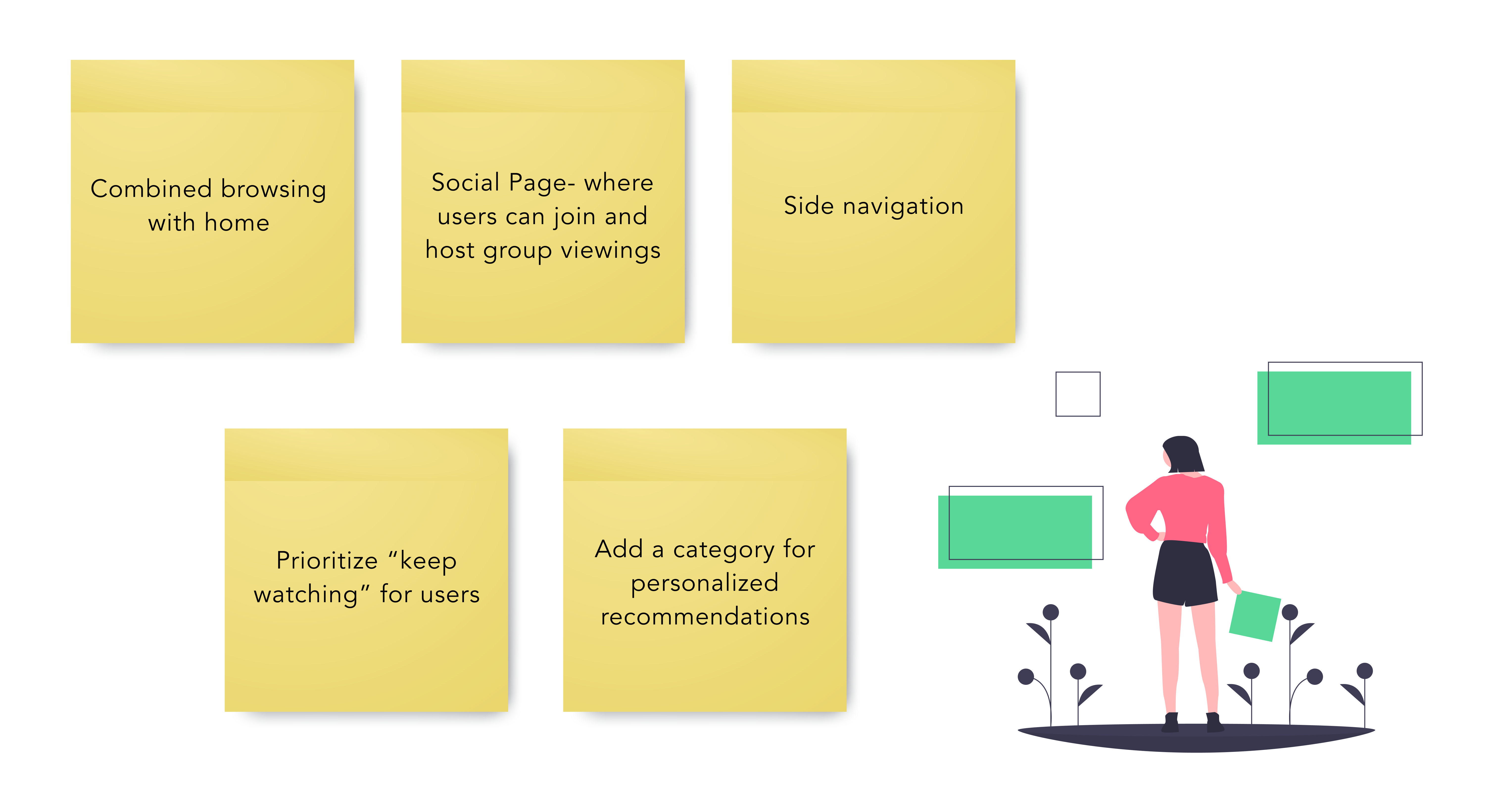
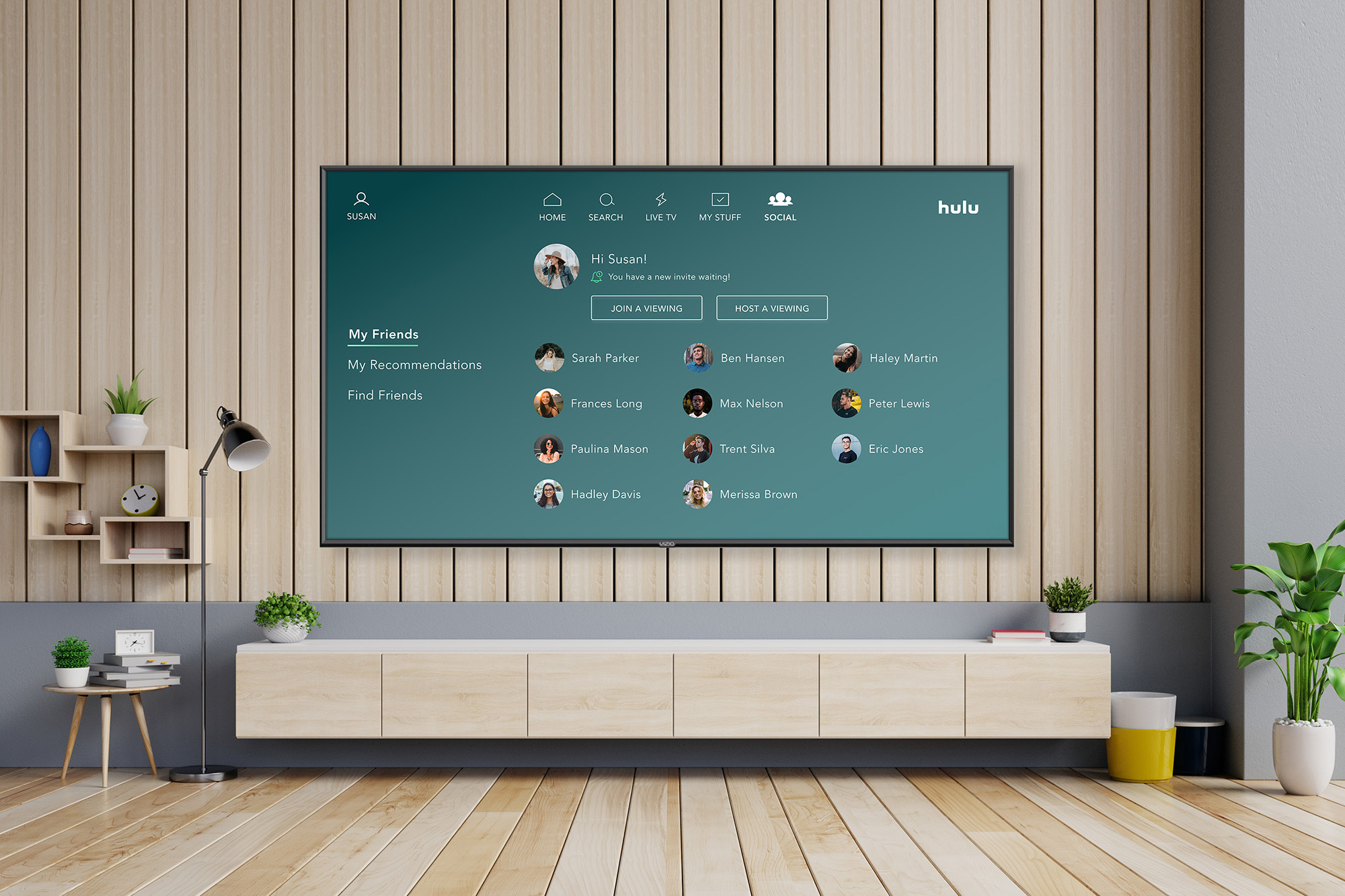
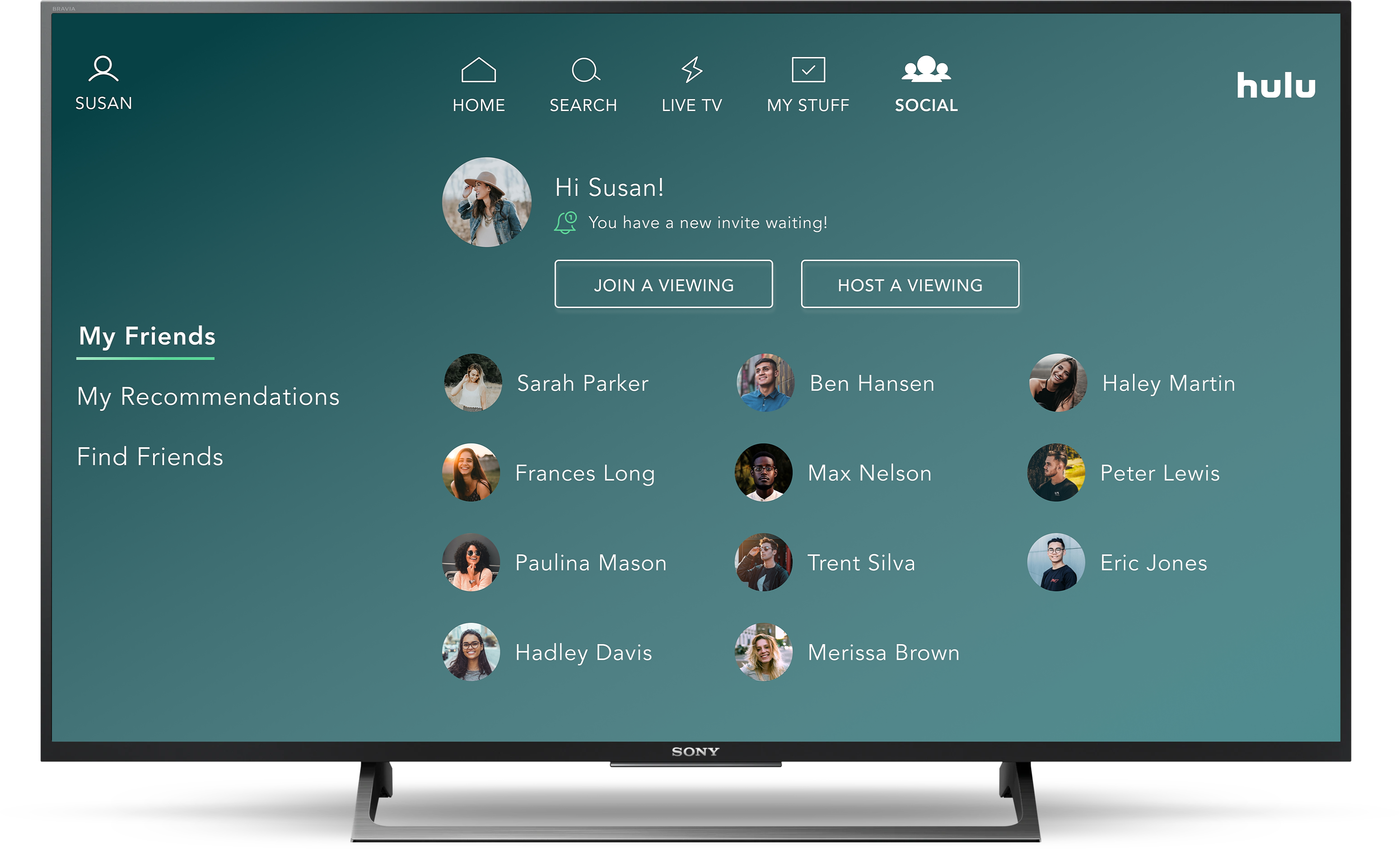
As mentioned before, we know that people are using streaming apps more than ever right now because of today's circumstances, so we also wanted to find a way to help users engage and connect with their friends and families while using them- which led us to the idea of a "social" feature. This would be a feature where users could add their friends who use Hulu and host group viewings where they could watch and control things at the same time through the Hulu TV app. This way they could video chat via FaceTime or Zoom and easily watch together.
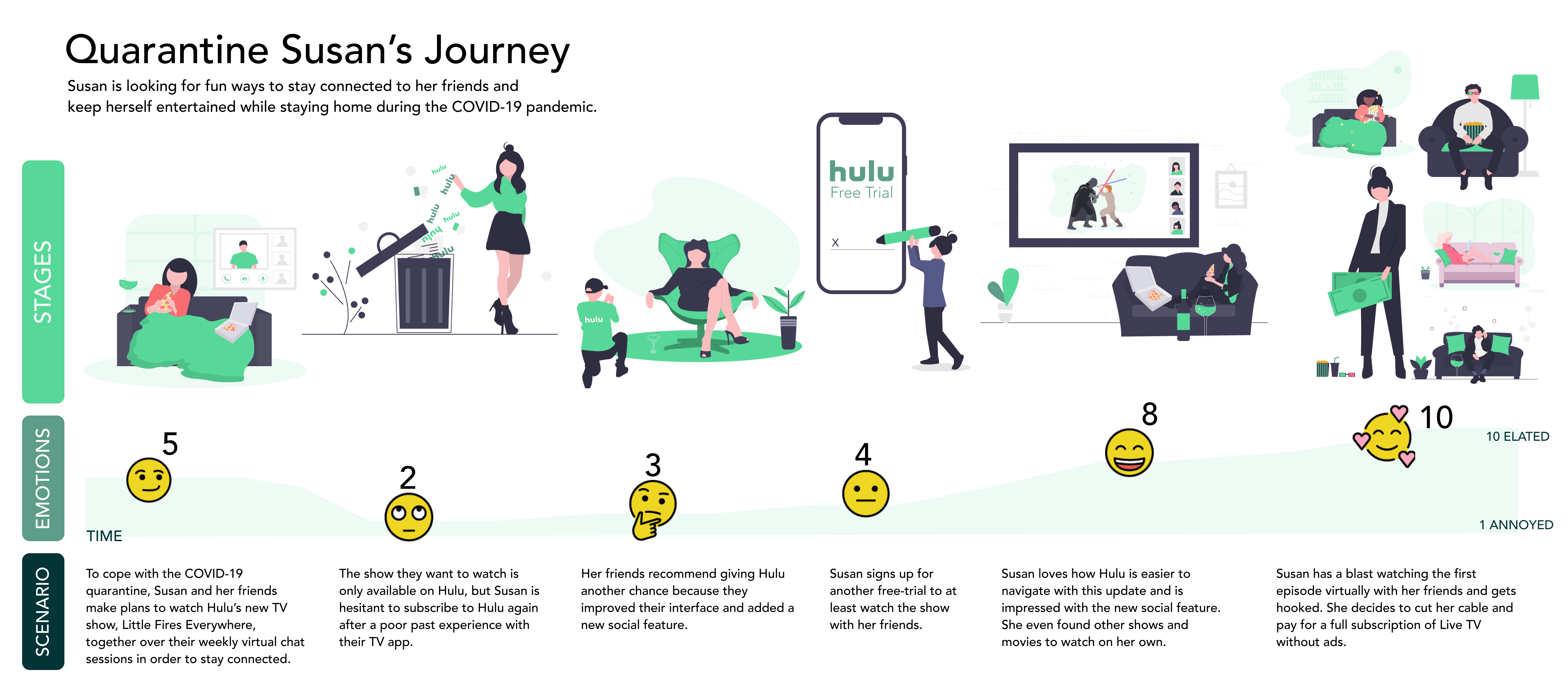
Storyboard + User Journey Map
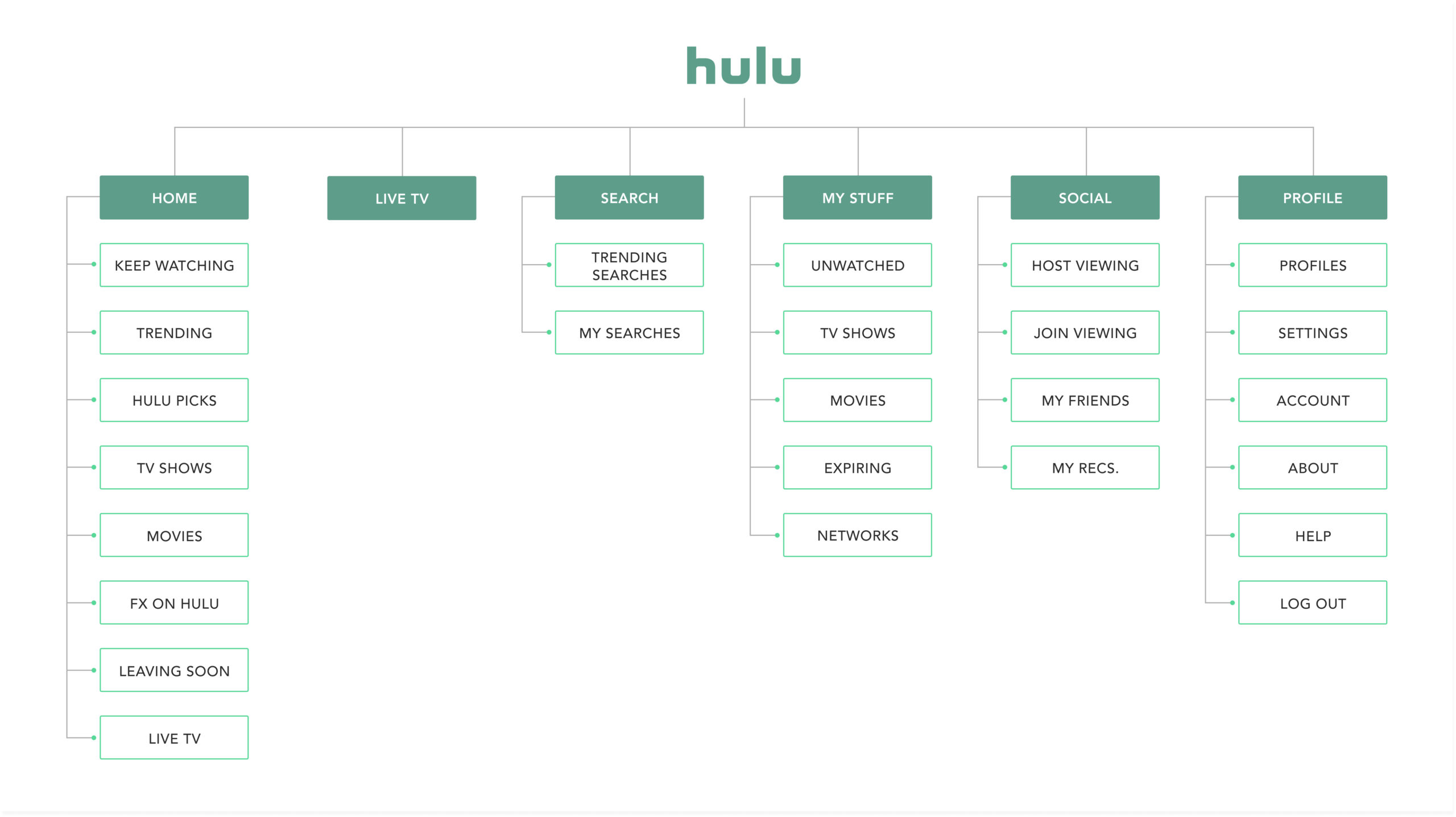
Site Map
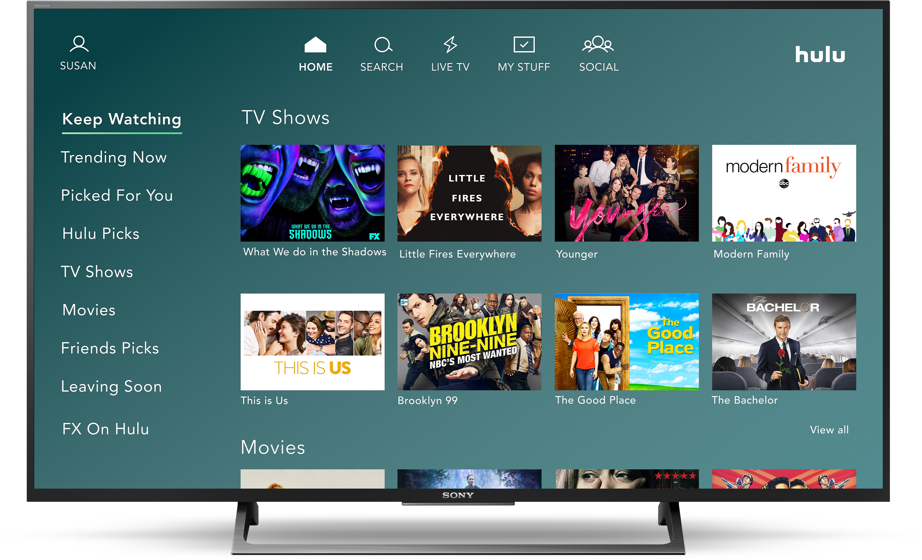
Hulu’s existing menu navigation includes Home, Live TV (if the user subscribes), My Stuff, Browse, Search, and Profile. Since the homepage behaves more like a browsing page as soon as you open the app, we consolidated the Browse feature into the Home screen. We also moved the Keep Watching screen as the first item on the homepage category list, so that it’s the first page you see. We moved Unwatched to the My Stuff page because it made more sense, and then we also added the new social feature.
User Flow
For our user flow we had two flows we focused on. The new navigation which involved browsing the homepage and selecting an episode to watch, and our new feature which is the Social screen- where users can see their friends and host a group viewing of an episode with them.
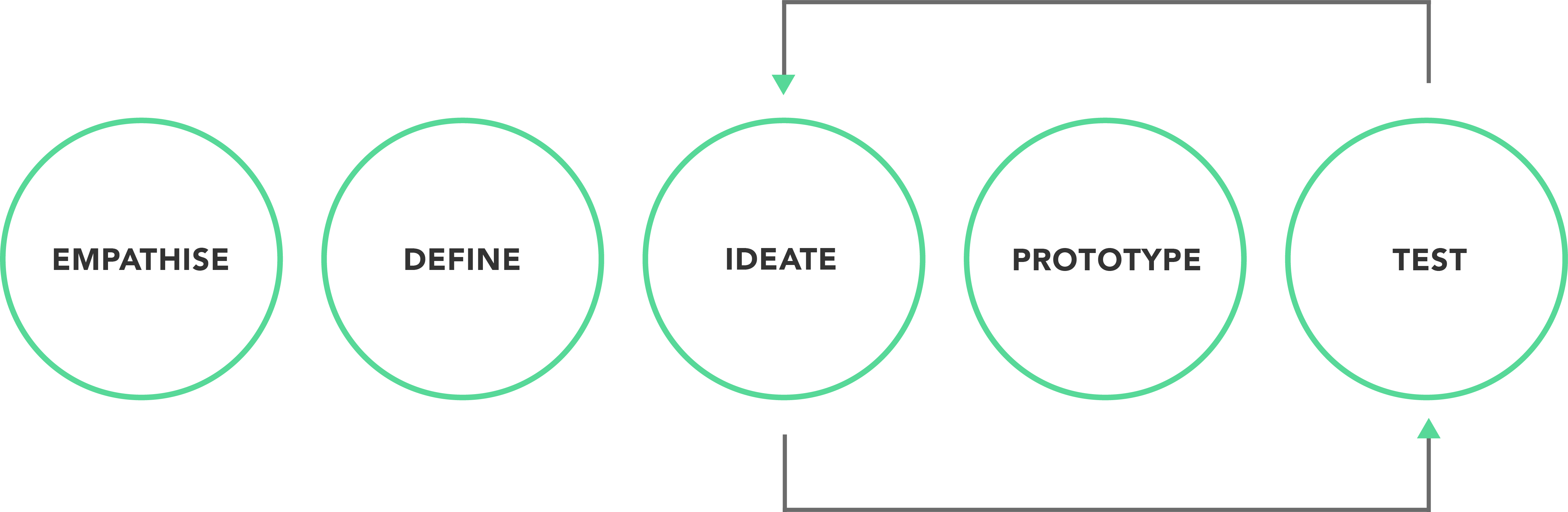
Phase 04, 05: prototype & test
Sketching & Wireframes
Once we had our user flow and sitemap we started to sketch out our ideas by creating some wireframes to see how the navigation was going to look, as well as the new social feature. We knew we wanted to test two different types of navigations, so another team member and myself each sketched our own wireframes which we would then turn into two different LO-FI prototypes so we could do A/B testing.
Solutions: A/B testing new navigation on LO-FI prototype
We created two different styles of navigation and conducted A/B testing to find out what users preferred. After four user tests we discovered that the navigation in test B is what users preferred. They liked being able to see all the categories on the side at once so they could easily get to them without having to do an excessive amount of scrolling.
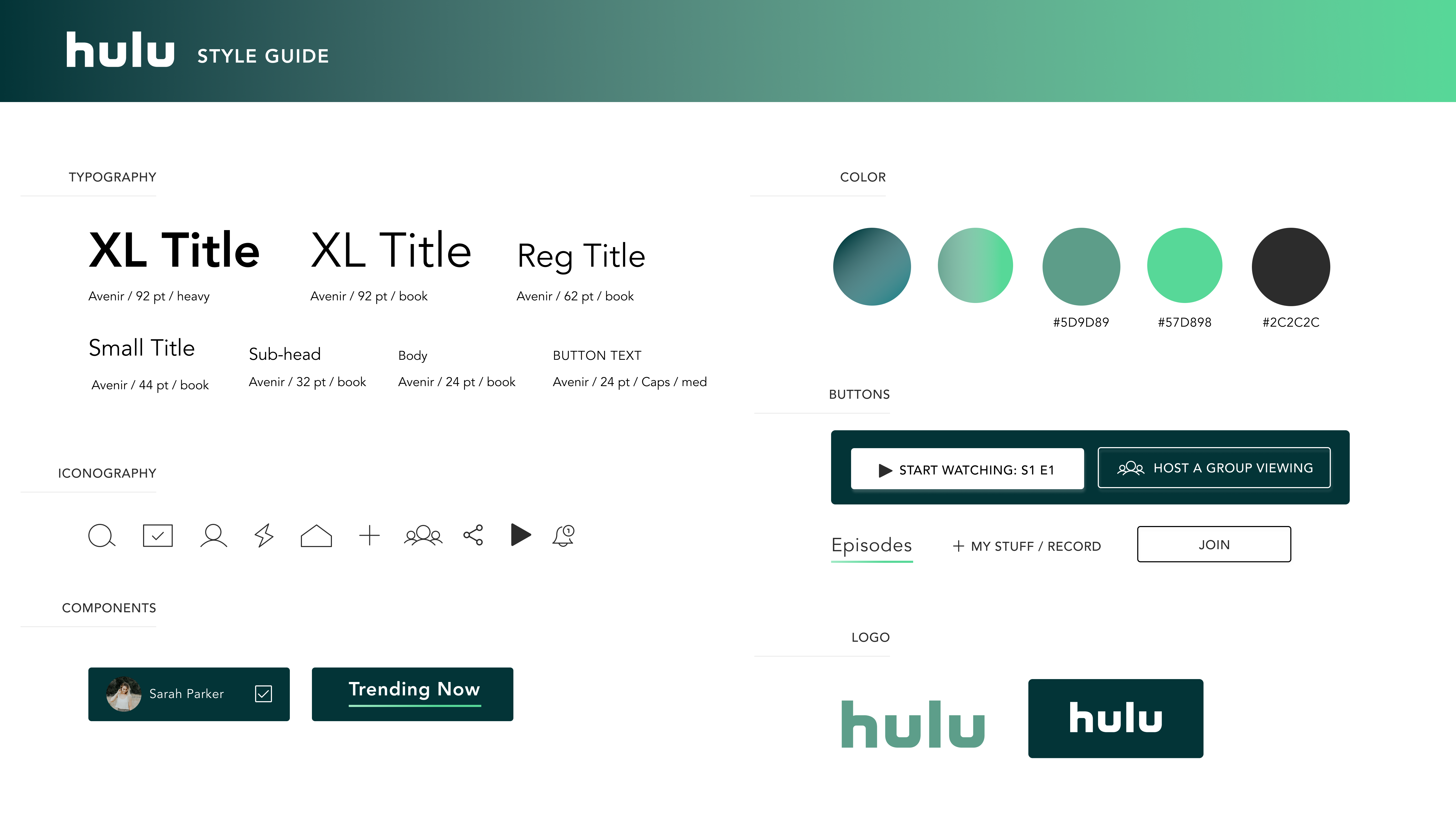
UI Design
With our style guide we wanted to keep the overall look and feel of Hulu’s branding which is very clean, modern and includes heavy gradients, while changing a few key things. We were suspicious about the color of their current logo which is almost a neon green (and is often used on a white background) and wondered if it passed color accessibility. We tested it and it failed. This led the direction of our color choices and choosing a different shade of green for the logo that was accessible, but still incorporated a bright green in the interface as an accent color.
Other details:
- Changed main background color from a blue gradient to a green gradient, since green is Hulu's primary color
- Changed the overline to an underline to make it more intuitive and user friendly (this was something that confused users in testing)
- Made icons, buttons and components to match Hulu's UI
STYLE GUIDE
the new homepage and navigation.
new feature:
the social page.
HI-FI prototype demo:
Conclusion & Next Steps
This project gave us a lot of insight into what users like in streaming apps in general and what frustrates them. We received really positive feedback with the changes we made and a lot of excitement about the concept of the social feature. This is something we'd love to see streaming apps incorporate into their platforms, especially given the current circumstances. Our design still needs a lot more testing and iterations but overall we were successful with our design goals for this particular project.
Some next steps we'd like to take are:
- Conduct user testing for our HI-FI prototype and reiterate designs
- Go more in depth and design more screens (for social, search, etc)
- Continue designing for other screens (tablet, mobile)
- KPI measurements:
- Increase in number of paying subscriptions
- Lower cancellation of subscriptions
- % of users using group viewings
- % of users recommending shows to friends
Thanks for reading!