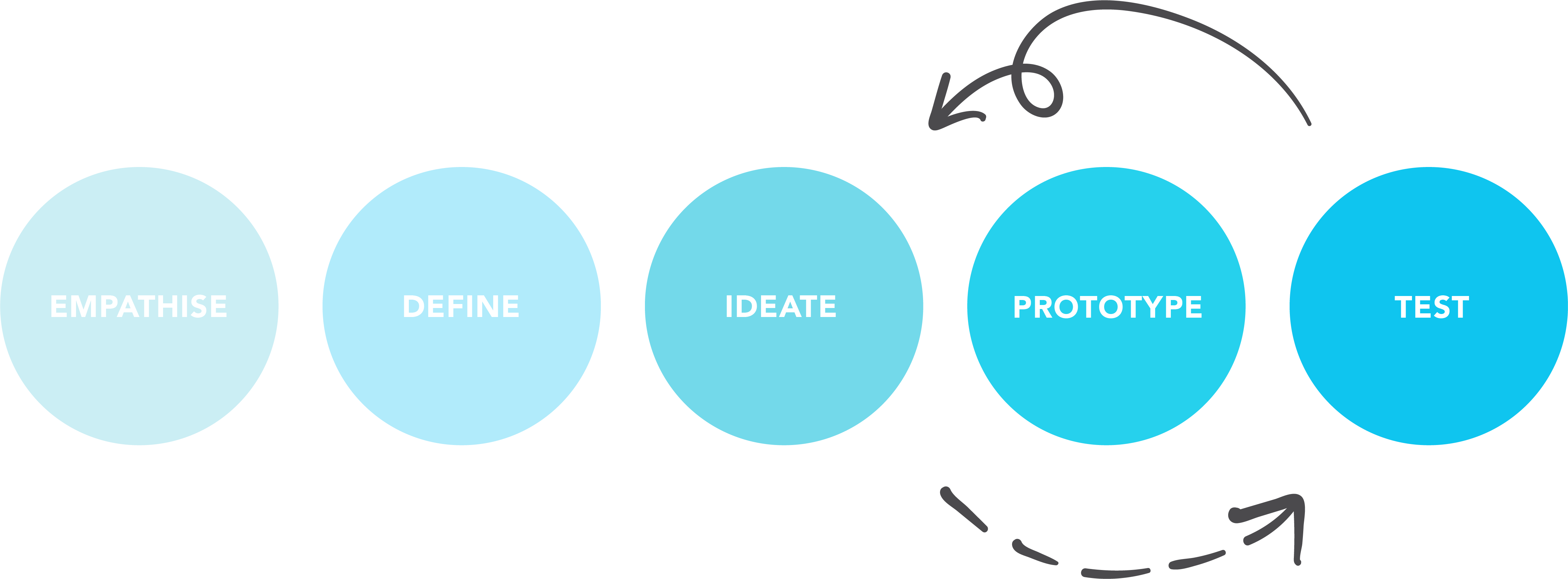
Responsive Redesign
Furry Friends Rescue: Provide a furever home.
When asked to choose a non-profit organization for this project, I knew right away I wanted to do an animal rescue organization. I'm a huge animal lover and wanted to use this project as an opportunity to help. Luckily my team members were also animal lovers and were on the same page as me. While looking for a local non-profit animal rescue organization to choose, we came across Furry Friends Rescue. We realized they are really unique because they don't have a physical shelter; all of their animals live in foster homes. While looking through their website, it was hard for us to find this important information about who they were. Their current website doesn’t showcase their unique mission and story. With this redesign, we want people to feel that emotional connection when they visit their website so that they will feel inspired to get involved and support their cause.
MY ROLE
Research, UX Design, UI Design
YEAR
2020
TOOLS USED
Figma, Miro
PROJECT INFO
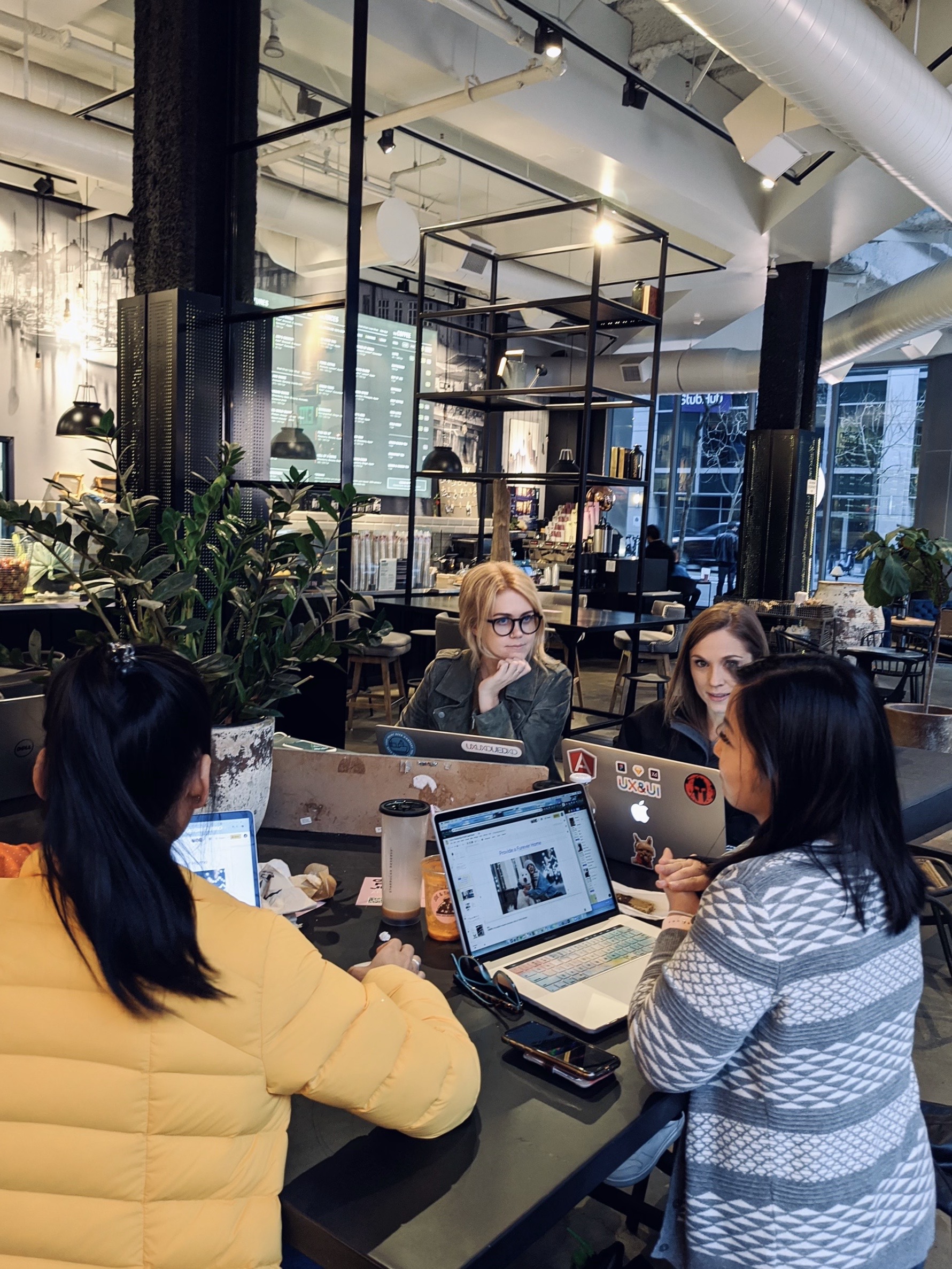
This was a three week long group project at UC Berkeley. We were asked to choose a non-profit organization and do a responsive redesign for their website. My team consisted of four designers including myself.
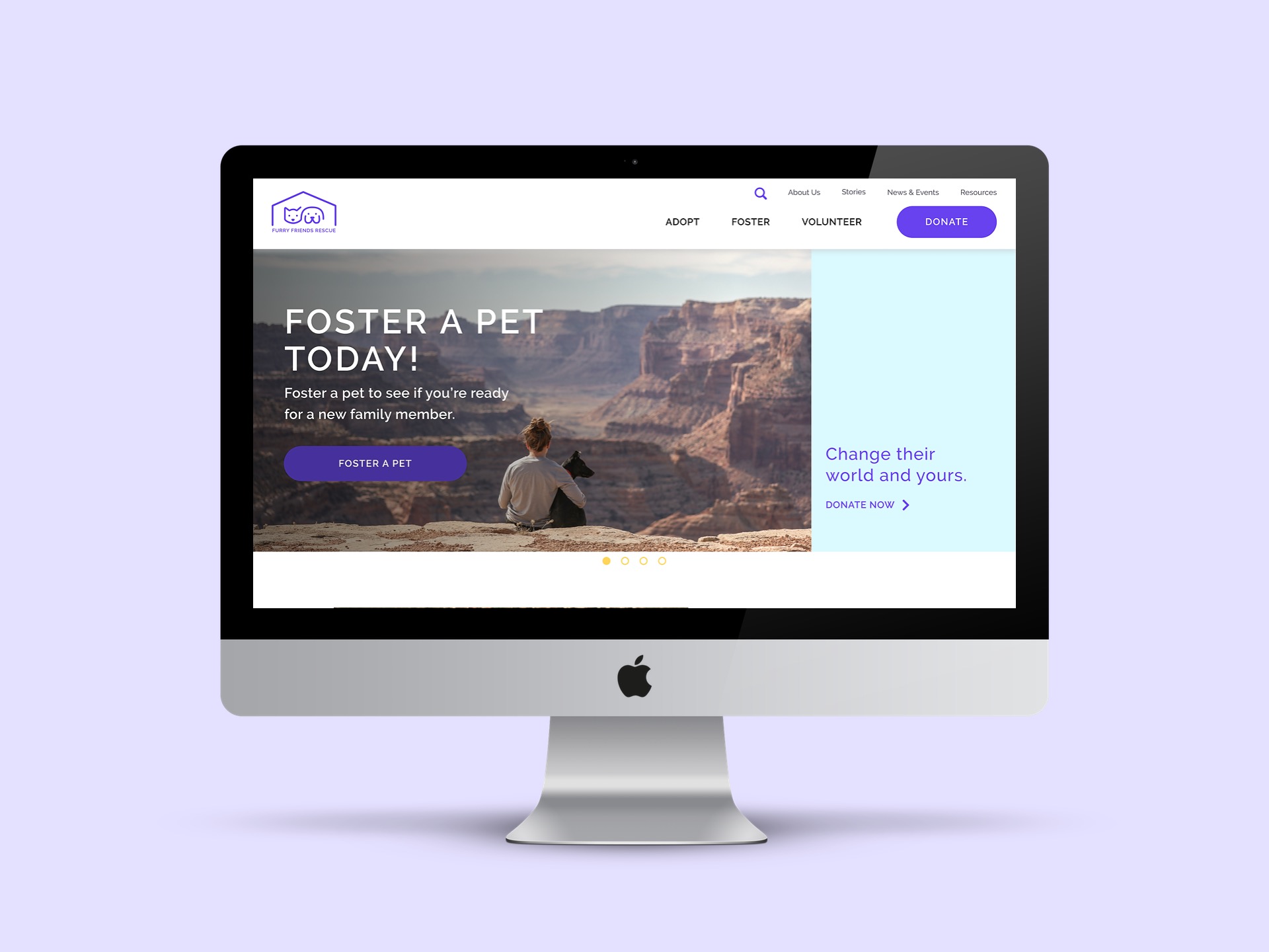
Before & After
Use the arrows in the middle to toggle between before and afer
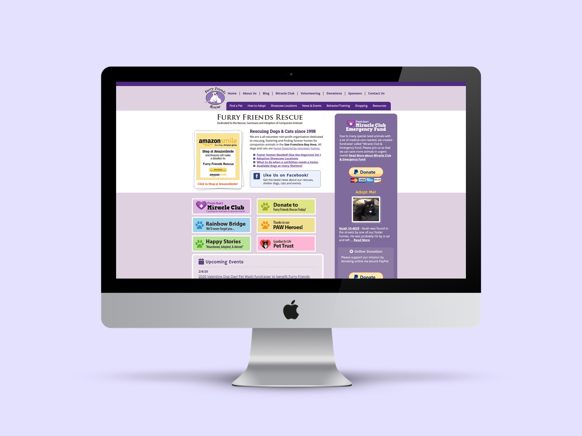
Problems with current experience
- No physical shelter
- Rescue and adopt out animals on "put to sleep" list (needing more foster homes)
- Unclear mission and story on website
- Missed call-to-action opportunities
Solution
- Strong storytelling and branding
- Emotional and enjoyable experience
- Ways to get involved remotely: Foster to Adopt & Donate
Phase 01: empathise
Analysis
We decided to test the current UI of the FFR site to get a better idea of how users felt about it. These were the key takeaways:
- Users felt the homepage didn’t look professional and seemed out of date
- Users were confused by the navigation and expressed there were too many terms in the navigation that they didn’t understand
- There was positive feedback on donating, however users were overwhelmed by all the options given
- Lastly, application forms for foster and adoption were so long, users would just abandon the task
Design goals: to make donating and filling out applications an easy and pain-free experience and to create an emotional connection between users and Furry Friends Rescue.
Research
QUALITATIVE RESEARCH
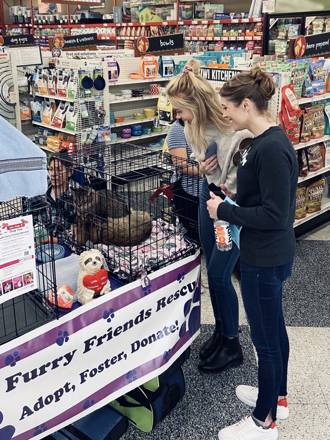
To get a better understanding of who FFR are and what they do, my team and I attended their Valentines Day event in Fremont in hopes of talking with the owner and volunteers. This experience gave us very valuable insight that we would not have otherwise discovered. In fact, this experience shifted the direction and goals of our entire project. We were able to meet some of the animals, spoke with volunteers (adult and junior) and had a ton of fun.
SURVEY & INTERVIEWS
We conducted 6 user interviews and sent out a survey that got 82 responses. This data gave us insight as to who our users were and what their goals and pain points were.
We learned that 76.5% of respondants want to see photos of the animals on the website and that it's one of the biggest reasons they would be visiting the site. So we decided that focusing on photos and showcasing the animals was going to be a huge priority.
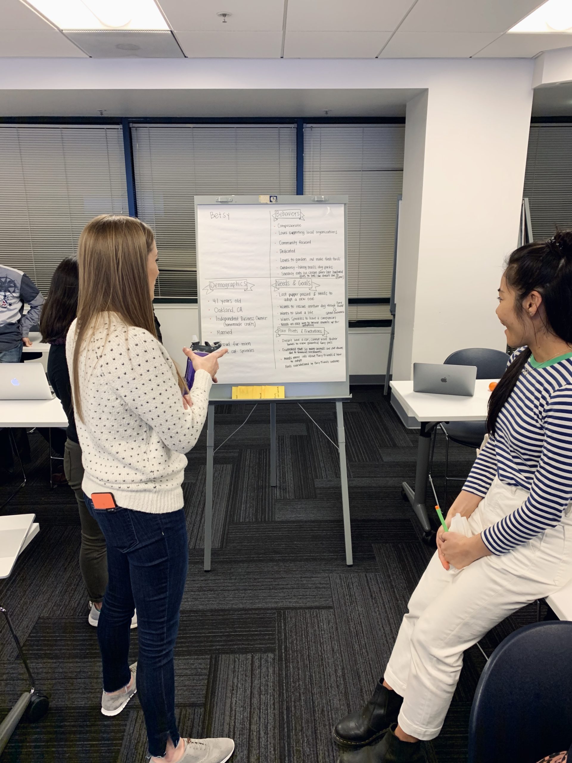
AFFINITY DIAGRAM & EMPATHY MAP
My team and I took the data we obtained from our research and organized it with an affinity diagram and empathy map. By doing this we were able to create our user persona.
Phase 02: define
User Persona
After organizing all of the data from our reseach with an affinity diagram and an empathy map, we now had a better understanding of who we were designing for.
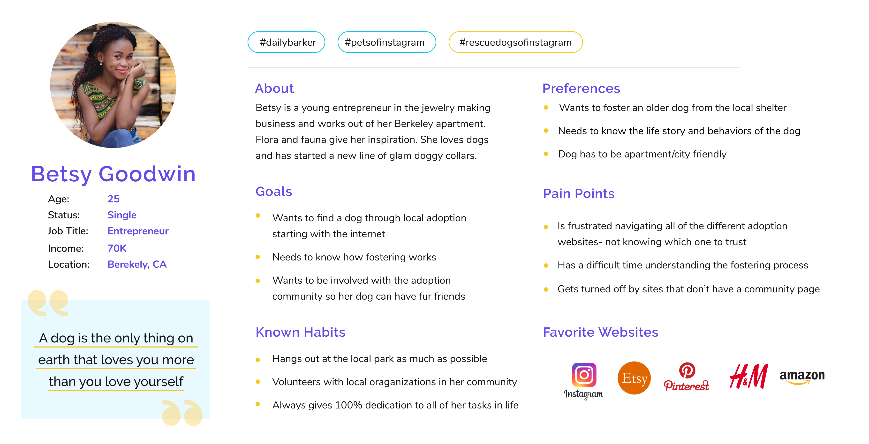
Problem Statement: How might we improve the Furry Friends Rescue website so that pet fosterers and adopters have a delightful experience throughout the entire pet adoption process based on an increase of pet adoptions?
How might we improve the Furry Friends Rescue website so that donors are successful based on an increase of donations?
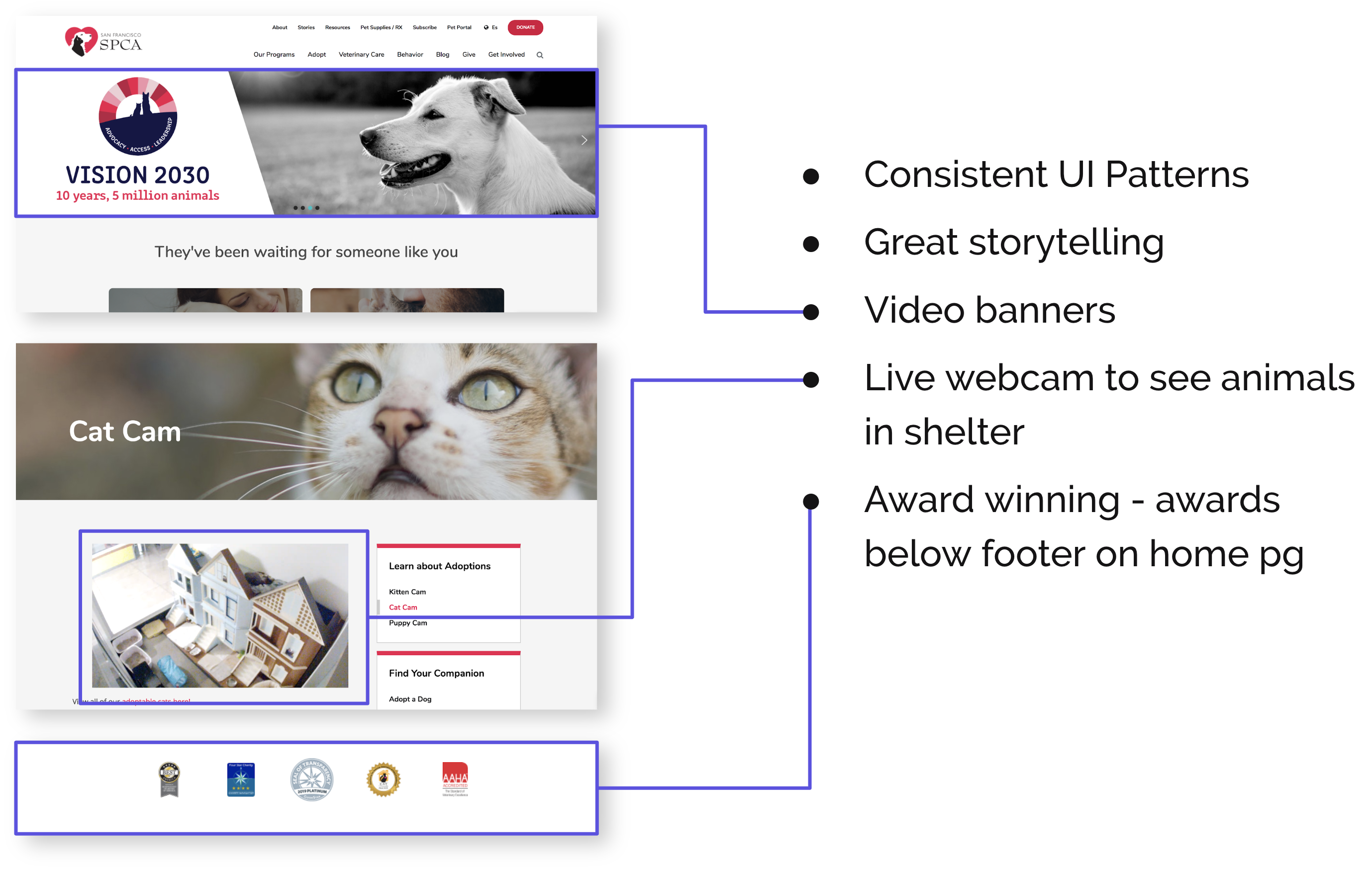
Competitor Analysis
We looked at six direct competitors but we decided to focus on the SPCA because it’s the most well known rescue organization in the area. The thing that stood out to us the most was their UI patterns and use of strong storytelling which you can see through their consistent use of large banners and call to actions.
Phase 03: ideate
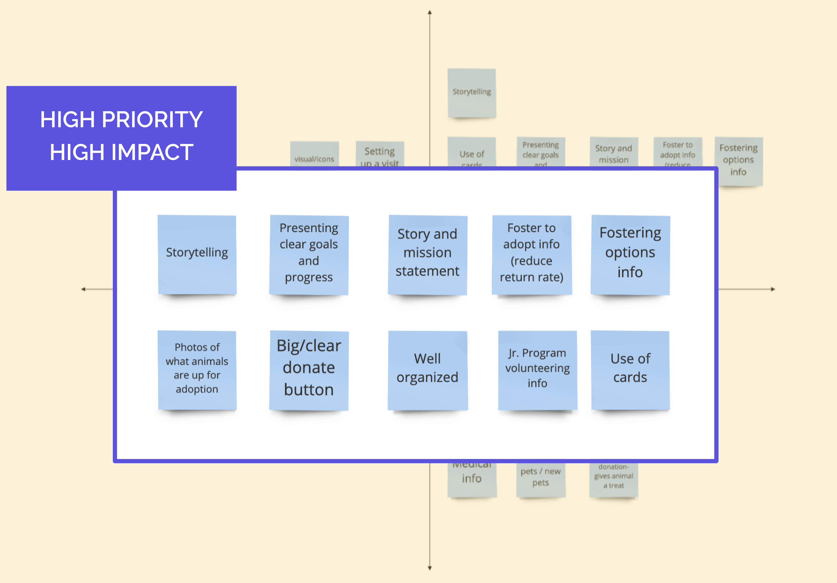
Feature Prioritization
Based on interview & survey data we brainstormed solutions. These are the things we decided were high priority:
- Branding & storytelling: goals, photos & mission statement
- Organization: information in organized cards & grids
- Foster to Adopt & Donations
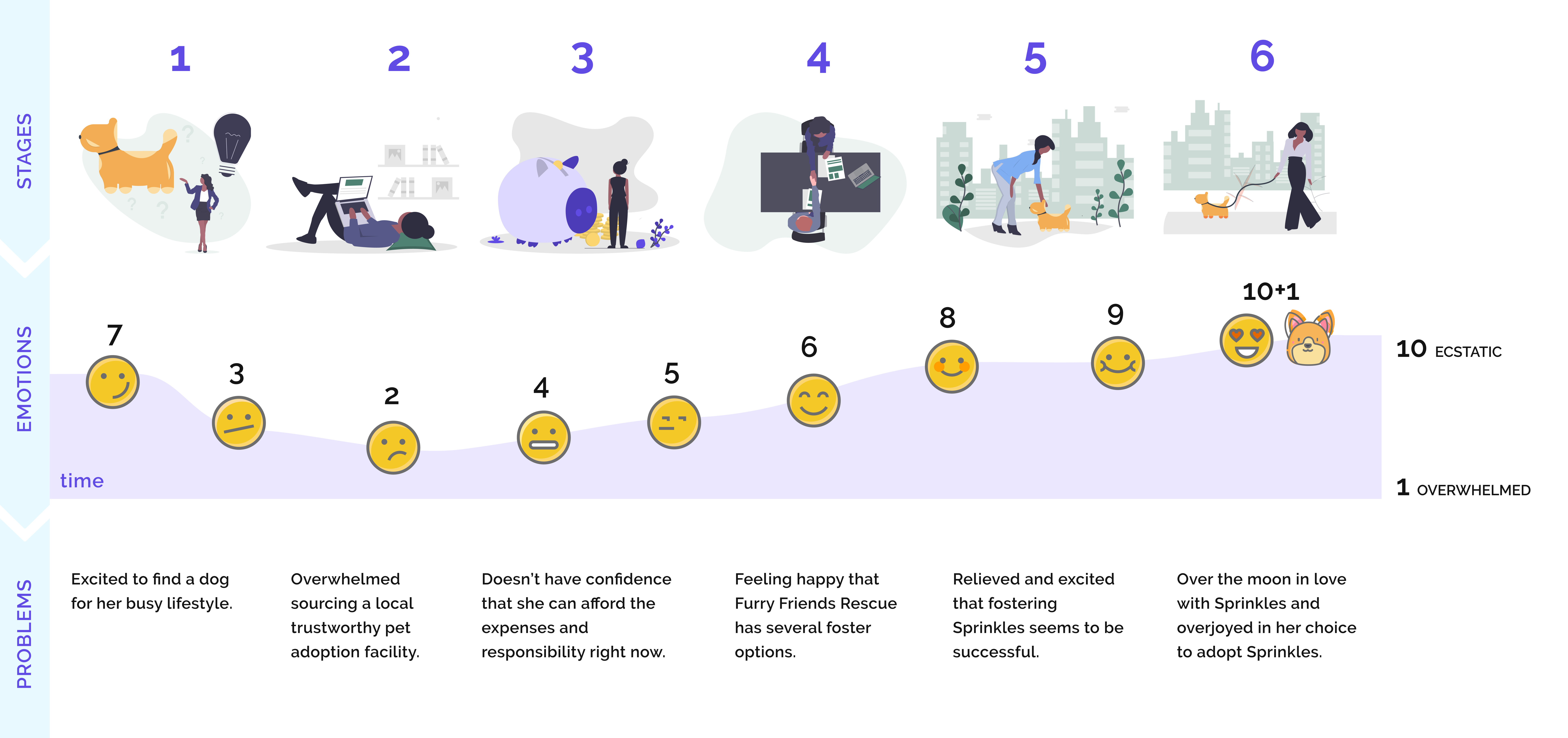
Ideate: Storyboard + User Journey Map
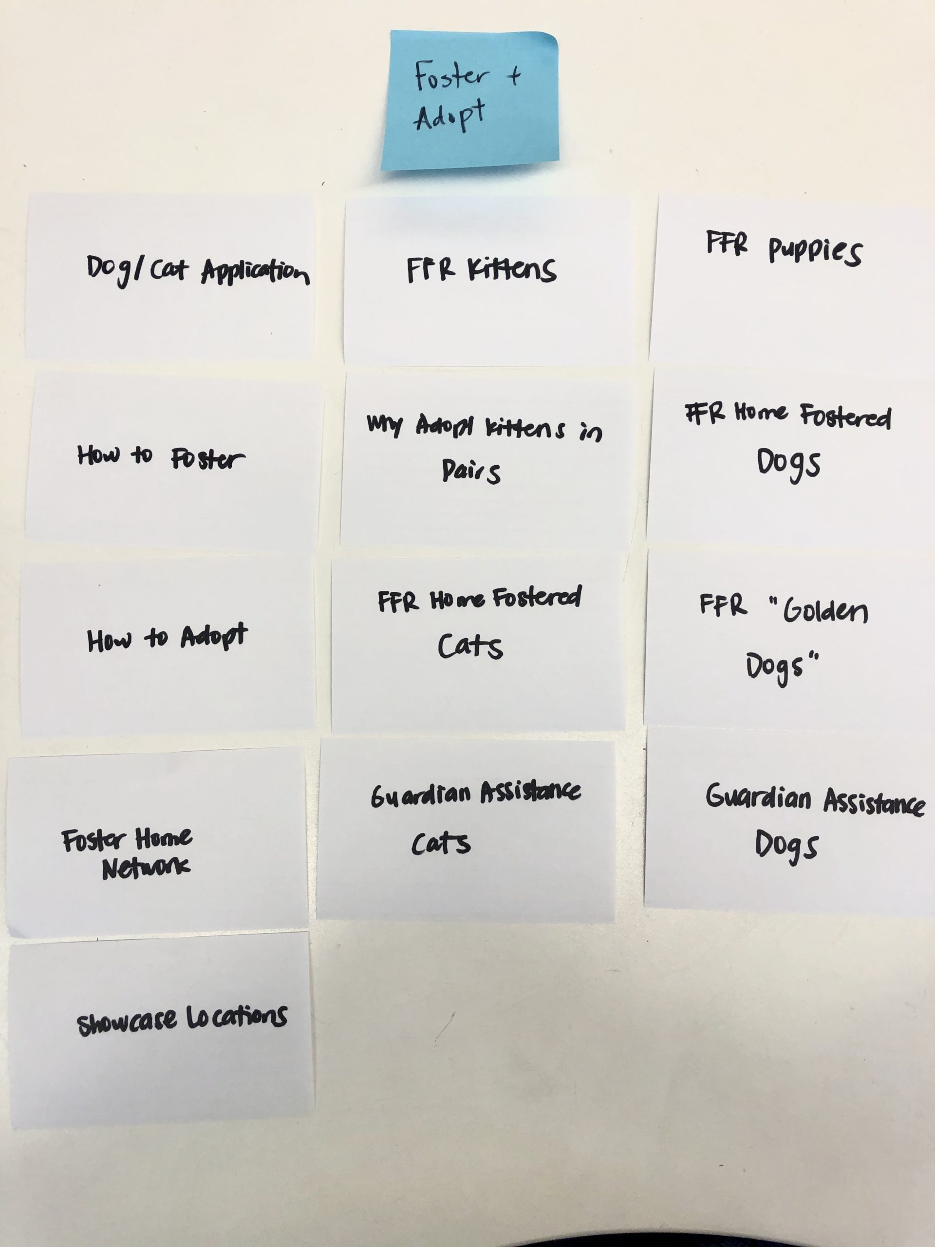
Card Sorting
We did card sorting with two of our team members and then two random participants to compare results. With these insights we were able to understand how we should organize the site and create our sitemap and user flow.
INSIGHTS:
- Donate was consistent among users
- Ways to find a pet was difficult to find
- Jargon was confusing
NEW NAVIGATION:
- Consolidated terms
- Separated adopt and foster
- Streamlined and promoted fostering
User Flow
Our goal was to make all tasks as easy and stress free as possible by reducing the number of clicks and optimizing a linear flow. We wanted to get people to be as engaged as possible by suggesting other actions to take - like donating.
Phase 04, 05: prototype & test
Wireframes & Paper Prototype
For this project we began our designs with mobile and later on expanded it to desktop. We generated two different paper prototypes for AB testing and focused on navigation and content to ensure users would have a clear call to action. Overall users felt our paper navigation was clear and easy to use - they also liked the idea of having a lot of pictures to get an emotional connection with the animals. We took elements that worked well on each paper prototype based on user feedback and combined them into the lo-fi prototype.
LO-FI & Usability Testing
With our LO-FI prototype, we implemented user feedback and then conducted six usability tests- three on mobile and three on desktop. We discovered some valuable insight which we made sure to implement in our HI-FI prototype.
These were the key takeaways:
- Users didn't understand the types of fostering offered and felt that finding out how to actually foster was confusing
- Users wished there was some kind of guidance or "next steps" after submitting their foster application
- FAQ - not a single user used this in the test or even thought to look for it when asked to find information on something, so we got rid of this feature all together
MOBILE
DESKTOP
UI Design
Overall, our main objective with the UI Design was to give it a much more updated and modern look by adding rounded buttons and corners, minimal typography, and bright accent colors. We chose yellow and blue to create a nice balance of happy, calm and playful.
Initially we wanted to move away from the purple color that is all over their current website and found it a bit "grandma". However, when we attended their event, purple was everywhere- their shirts, tables, signs, etc. We realized how important this color was to them and that it was part of their identity, so we decided to keep it and just brighten it up to make it feel more modern.
STYLE GUIDE
UI COMPONENTS
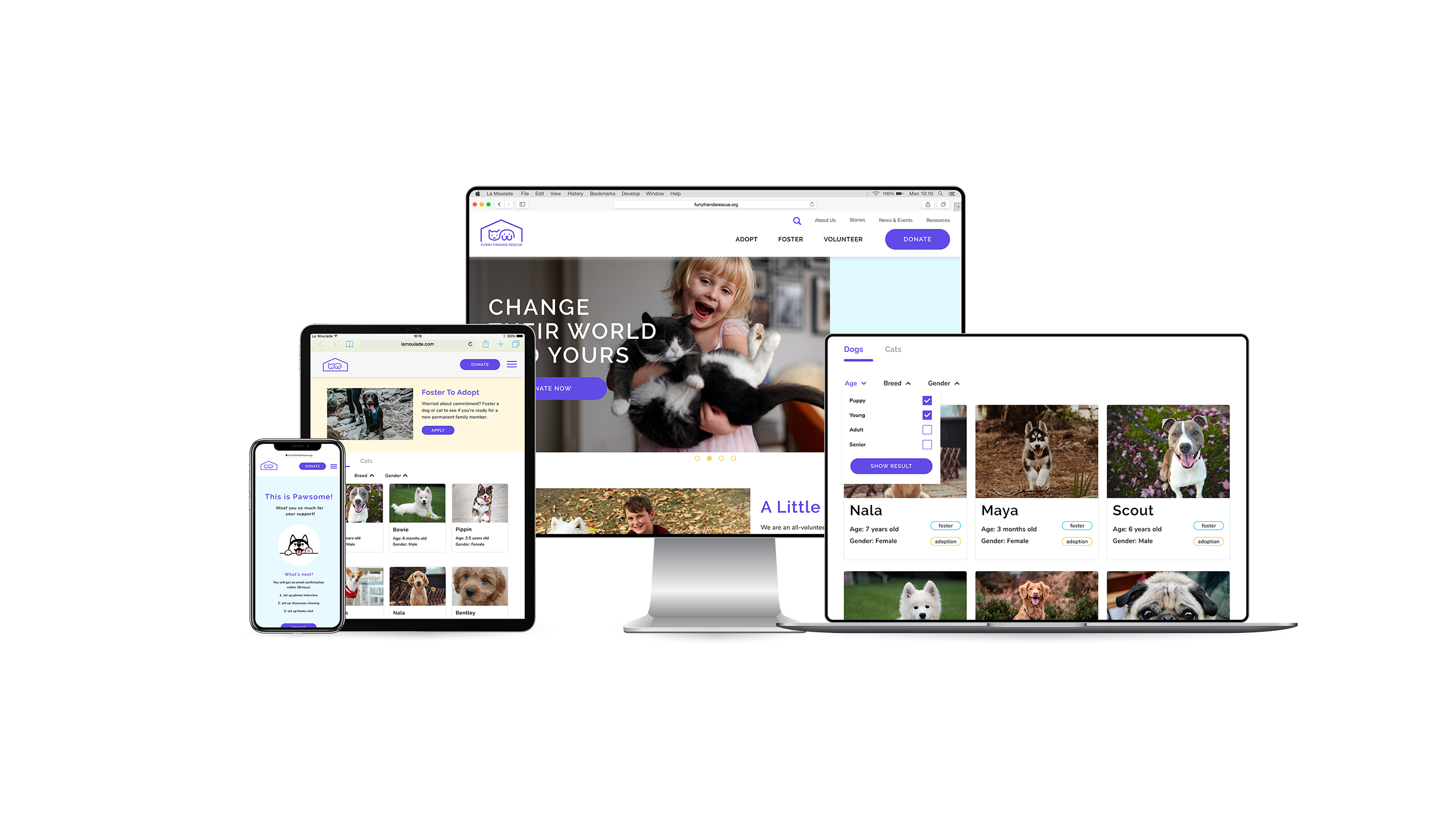
Responsive HI-FI
As mentioned earlier, we started our design for mobile, creating paper wireframes and a LO-FI prototype to get an idea for UI components and features. However, we decided to generate the HI-FI in desktop first, and then make it responsive to mobile as our users are more inclined to use the desktop site first over mobile. We used a 12 column grid for desktop and used a 2 column grid for mobile.
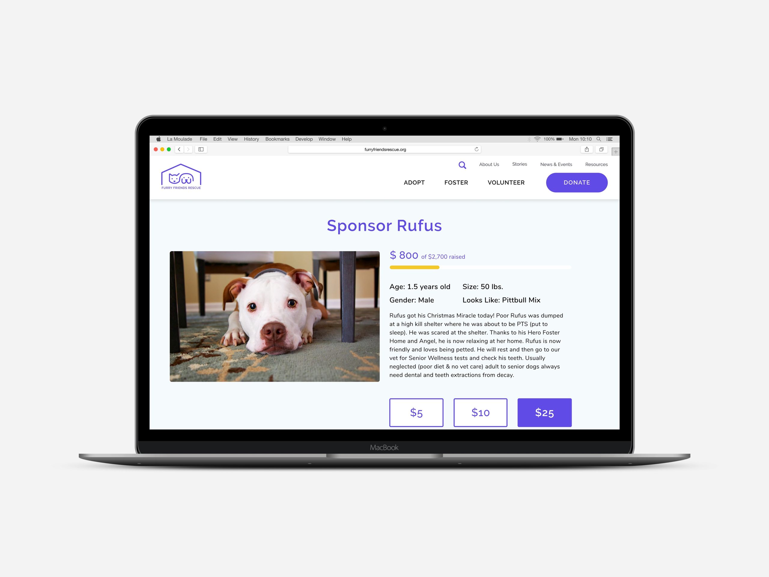
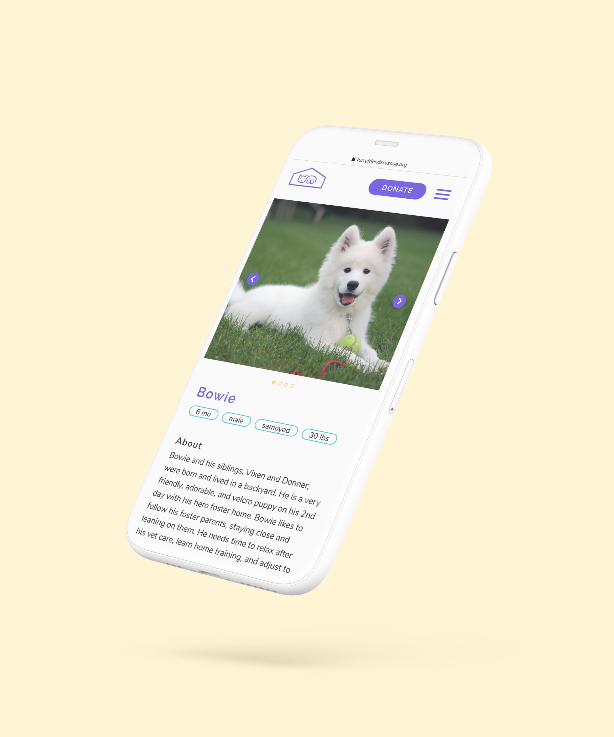
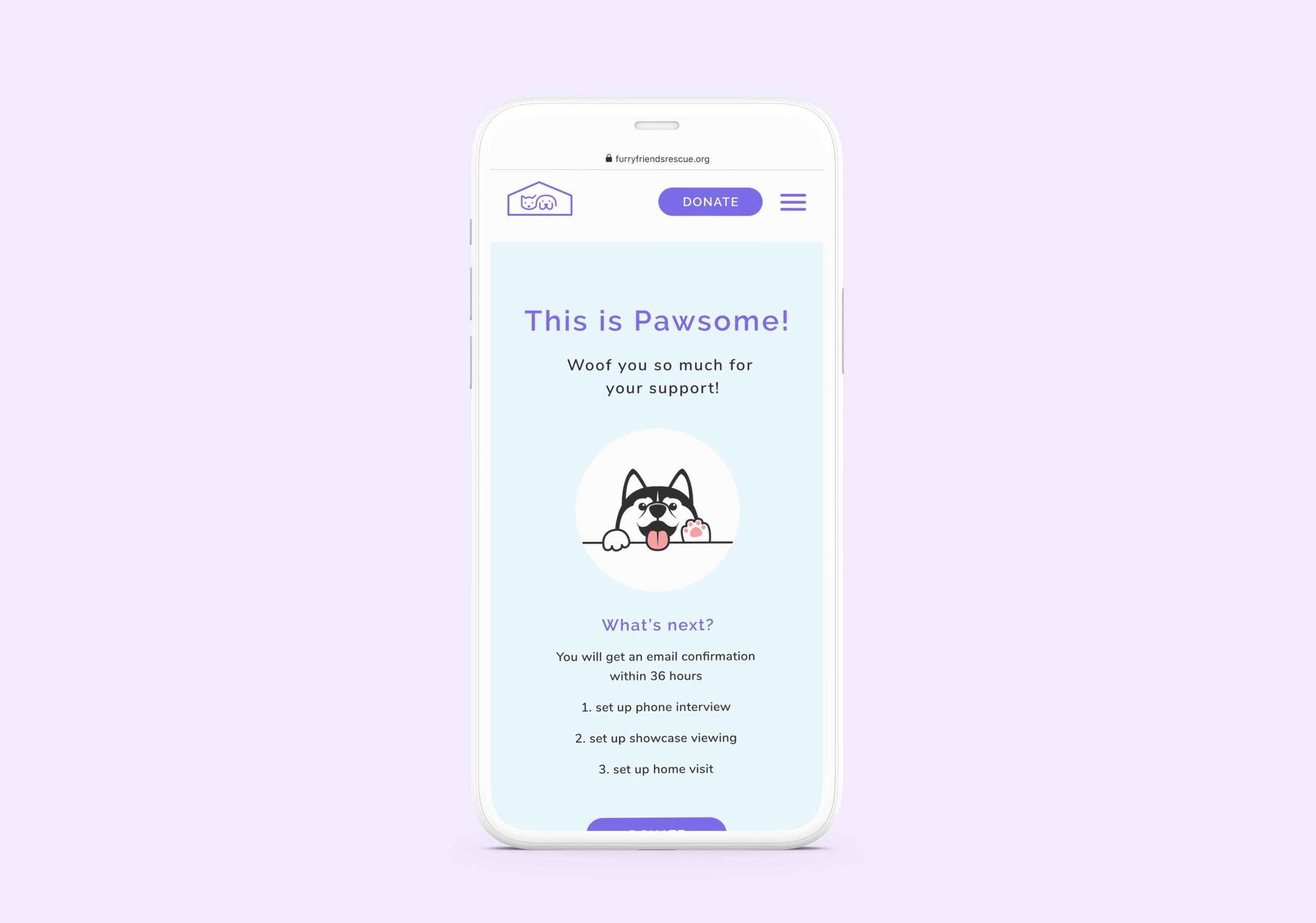
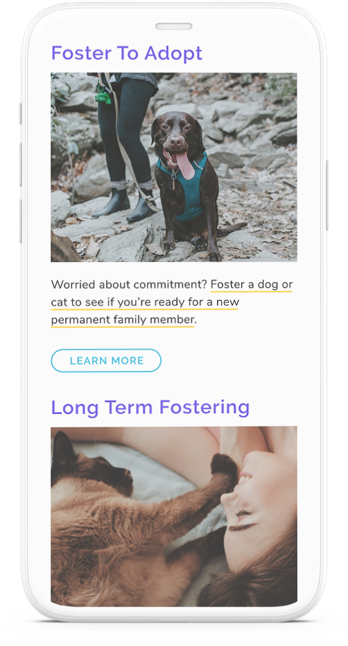
HI-FI Prototype: meet the new Furry Friends Rescue
HI-FI Usability Testing: Key Insights
ORDER OF TYPES OF FOSTERING
Users felt the order should be listed from lowest commitment to highest commitment - starting with "short term fostering", which is the opposite of how we ordered it. We want users to engage with the organization, therefore we should start with the lowest barriers to entry and the easiest ways to get involved.
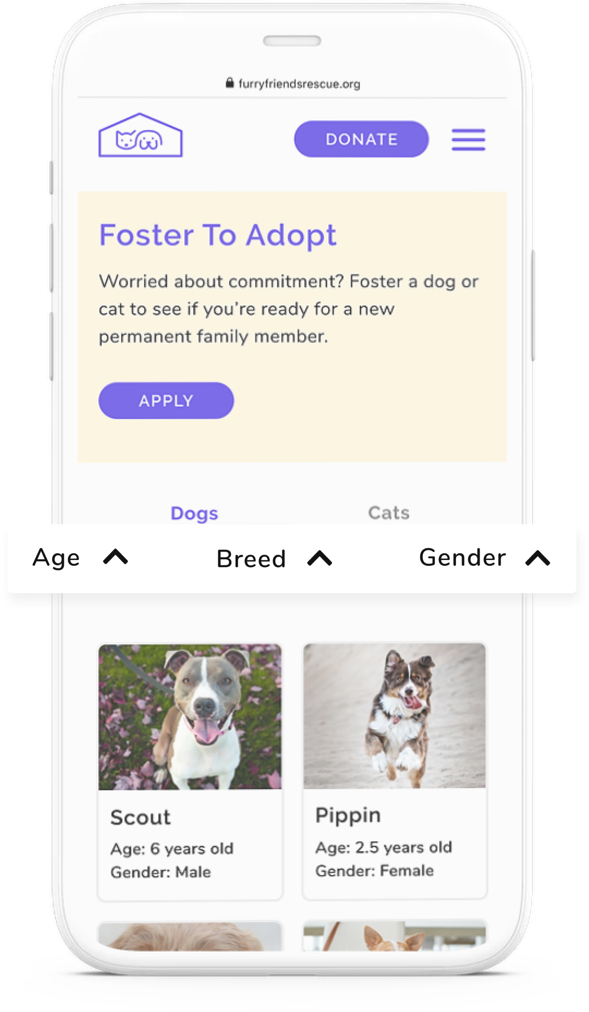
PET BROWSING FILTERS
When browsing the pet cards, users did not realize there was a search feature to help them. When asked to search for a young dog, people looked directly at the cards to see the age- they didn’t notice the filters at first. Once they noticed them they were happy the filters were there and said that next time they would definitely use them. So we want to better signify those search filters so people can use them if they want.
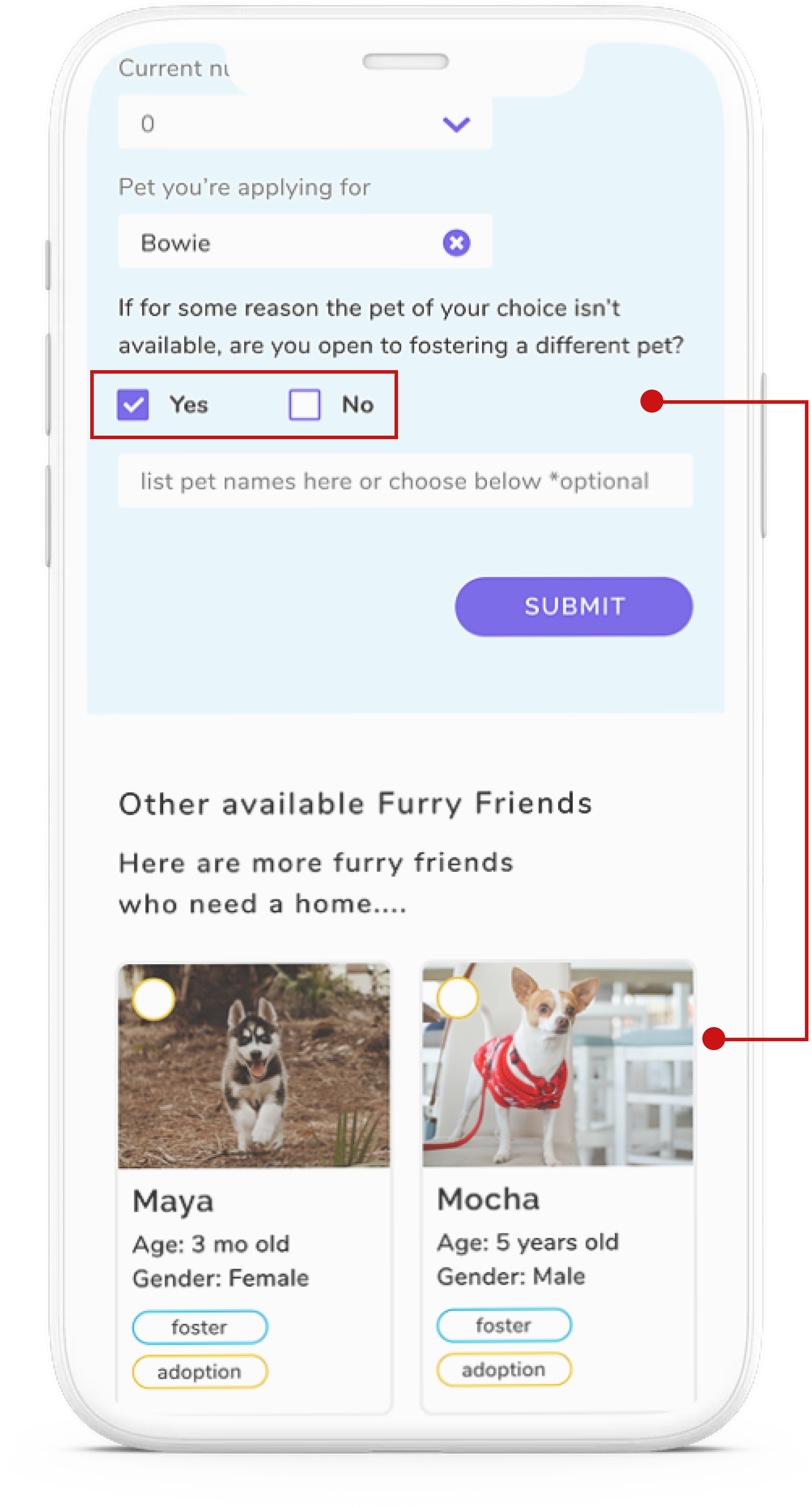
APPLICATION FORM - ADDING ADDITIONAL PETS
When users filled out the form, they didn’t realize they could add additional pets in case their first choice was no longer available. If they clicked the yes box, additional pets SHOULD pop up right underneath it, pushing the submit button down. This would prompt their next action of choosing an alternative pet. Currently, the additional pets are listed below the submit button (which almost feels like a new section). Users didn’t scroll down and instead clicked on the submit button. We want to eliminate users from having to scroll up and down on the page and the risk of users abandoning the task all together.
Conclusion & Next Steps
Overall users really enjoyed using the website on desktop and mobile. They loved all the photos, found it very easy to navigate and said it inspired them to get involved with Furry Friends Rescue. That was our main goal with this redesign- to get users emotionally connected. We really enjoyed working on this project and became very invested in their story and cause.
Here are some next steps we would like to take:
- A/B test the mobile navigation drop down menus
- Create the Volunteer & Adopt screens
- Create a quick view pop-up box on the Foster application page, so that users can quickly view other pet profiles without leaving the page when adding additional names to their application
- Add more animation
Thanks for reading!