Dreamer is a concept for a photo based travel planning app, made not only to save users time but make their planning experience more creative and enjoyable. Dreamer is a tool, but designed to feel like a toy.
Individual Project for UC Berkeley
MY ROLE
UX Design, UI Design
YEAR
2019
TOOLS USED
Sketch, InVision, Miro, draw.io
OVERVIEW
In recent years, travel among young adults has become a more common and popular thing to do. The need for travel planning tools and resources has increased so that people will not only be well prepared before traveling, but also can discover fun and popular things to do in the places they are planning to go. This travel app will help users stay organized, find inspiration and quickly plan trips, overall resulting in an overall more enjoyable travel planning experience.
Process
For this project I followed the design thinking methodoly. Since this project was not based off of an existing product, I first developed a proto-persona and established a problem and solution that I could build off of, which later would develop into my problem statement.
PROBLEM
Travel planning is time consuming and overwhelming.
SOLUTION
A photo based travel planning app that saves users time and provides a more enjoyable travel planning experience.
Empathise
RESEARCH QUESTIONS
1. What types of features do users find most helpful?
2. What frustrates users when travel planning?
3. What inspires/motivates users to travel plan?
4. What are users highest priorities/goals when travel planning?
5. How can we save users time?
6. How can we make travel planning a more enjoyable experience?
INTERVIEWS AND SURVEY
In order to start collecting real data, I conducted five user interviews and sent out a survey to get an understanding of what users pain points are when it comes to travel planning.
“I really like apps and websites that are visual. I like ones with
good reviews, are easy to navigate and pretty to look at”
- Sarah
“I enjoy the experience of traveling but not the
research process, it’s tedious”
- Nate
KEY USER INSIGHTS
- People think travel planning is too time consuming
- People feel travel planning can be frustrating and overwhelming
- Many people use social media apps, such as Instagram, to help with travel planning
- Many people do not enjoy the experience of travel planning
- 56.3% of survey participants said that photos are what inspire and motivate them to travel
WHO AM I DESIGNING FOR?
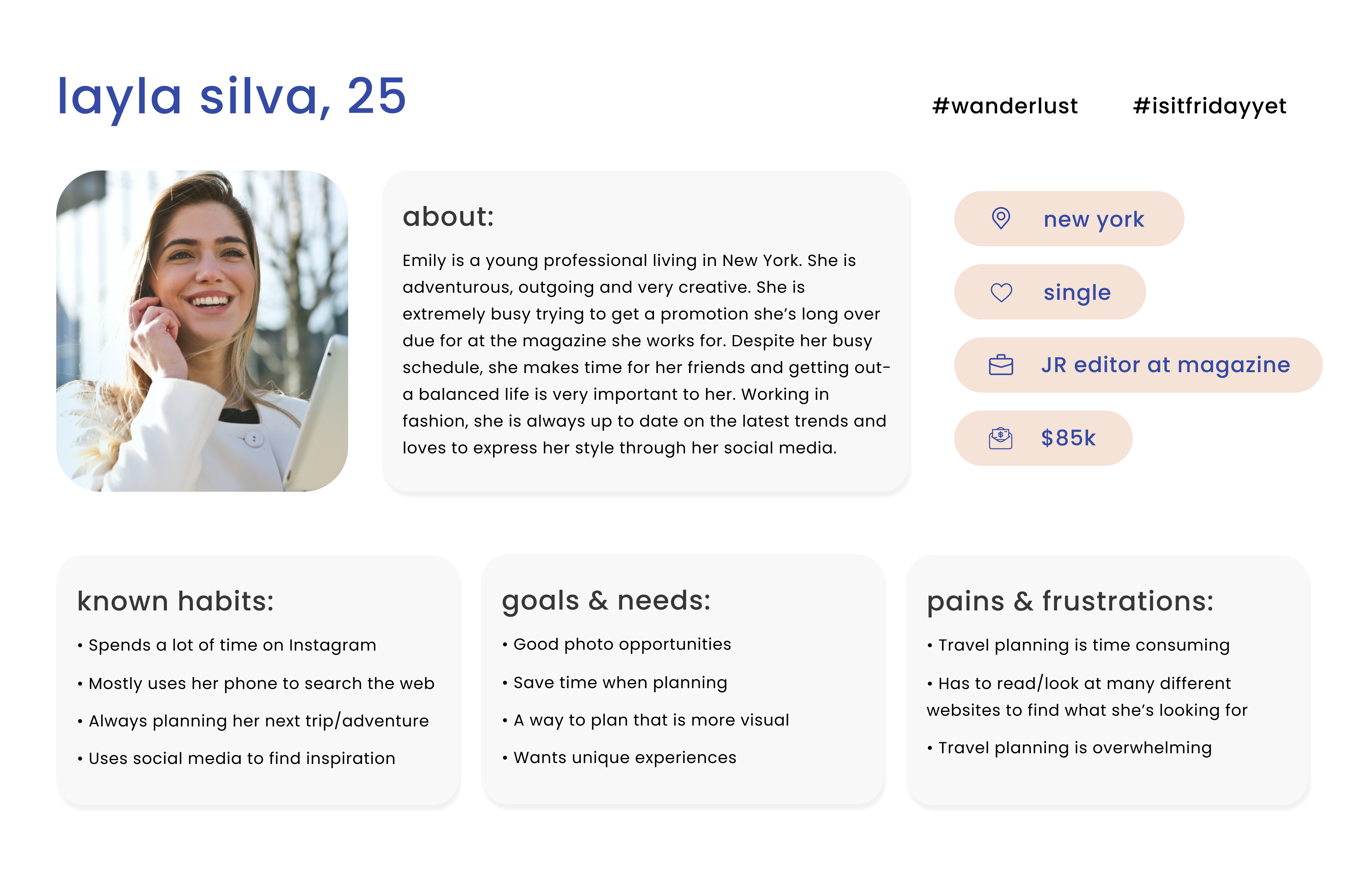
After organizing my data in an affinity diagram and making an empathy map, I was able to create a more accurate user persona that was based off of real data.
With this persona, I now had a much better idea of who I was designing for and how I might improve their user experience when it comes to travel planning with my app.
Define
During user interviews I discovered that people like to use apps and websites that have lots of photos. Because of this, I believe people would also prefer to use a travel planning platform that is primarily based on photos.
I might do this by creating an app that allows users to use a search engine that will produce photos that users can view and gather the information they need to plan their trip. Users could search by key words or categories and also save the photos and create inspiration boards for every trip they plan.
USER INSIGHT STATEMENT
“The young woman needs a more visual way to travel because she needs to save time and enjoys looking at photos rather than text.”
PROBLEM STATEMENT
How might we create a travel planning app that will save users time and make travel planning a less stressful and more enjoyable experience?
Ideate
Once I had an understanding of my users, I needed to analyze my competitors to see what things work well and where there was room for improvement. By doing this I was able to prioritize the features my app was going to have.
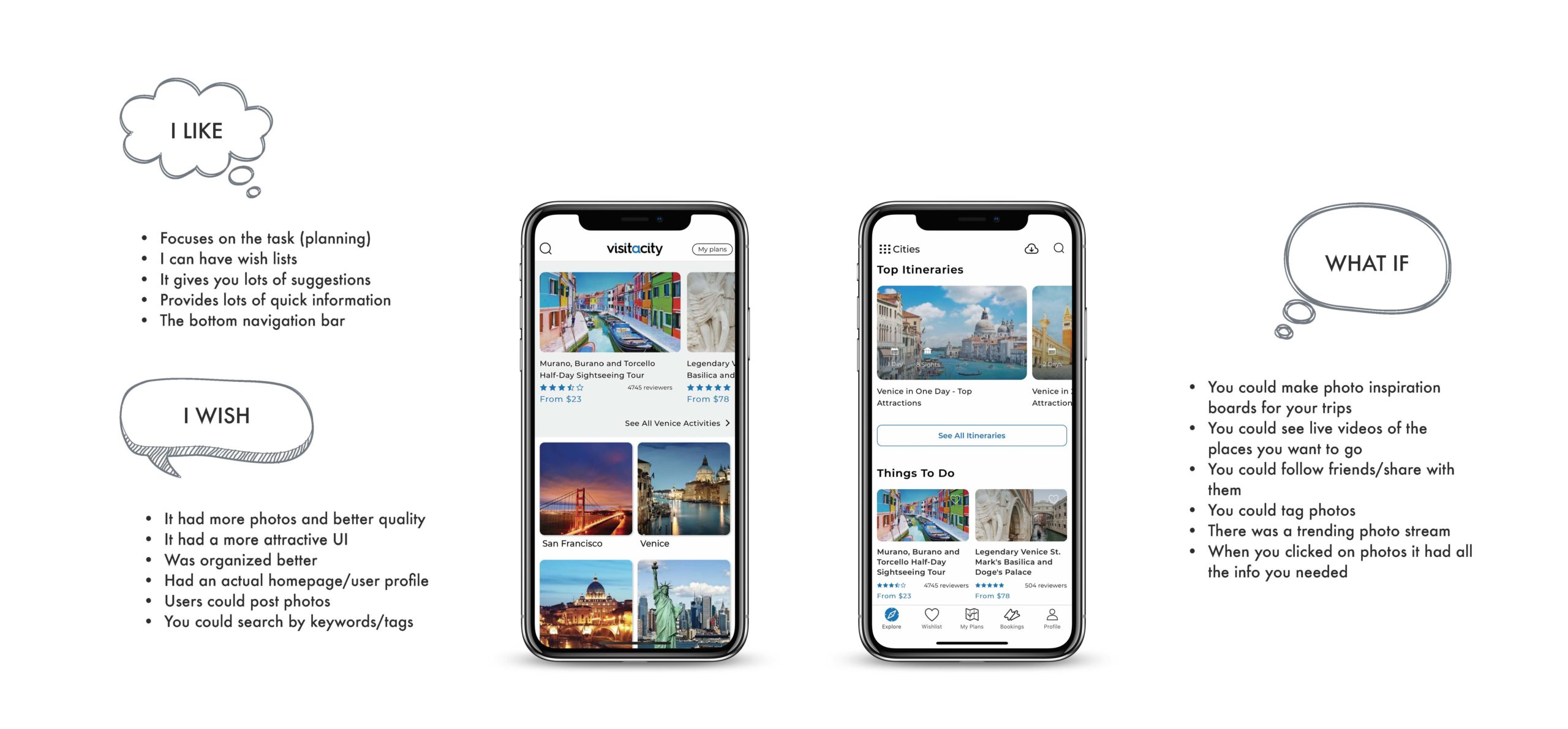
I took a close look at this app "Visit A City" because it was the closest app I could find similar to my concept; their app is primarily photo based. I dove deep into their app and started to write down the things I liked about it so I could organize my thoughts and build off ideas.
Key ideas and thoughts:
- I wish the content was more organized
- I wish you could make boards for your trips and inspiration (kind of like Pinterest) where you can save photos of places you want to go
- I wish it had an actual homepage/user profile that was personalized
- What if there was a photo stream of trending places to go?
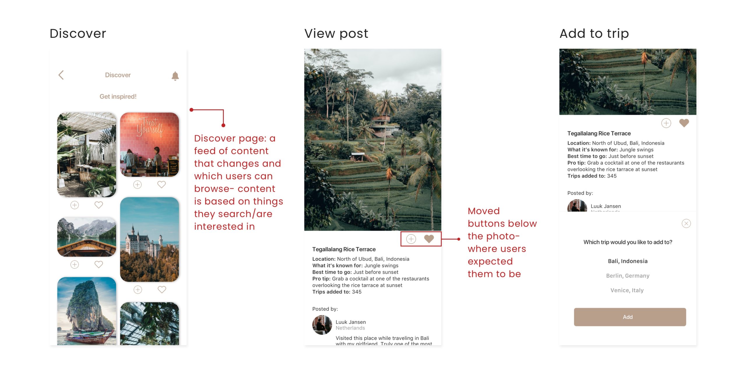
- What if when you clicked on a photo, it has all the information you need about that place as well as personal tips from people's real expriences?
Wireframes &
LO-FI
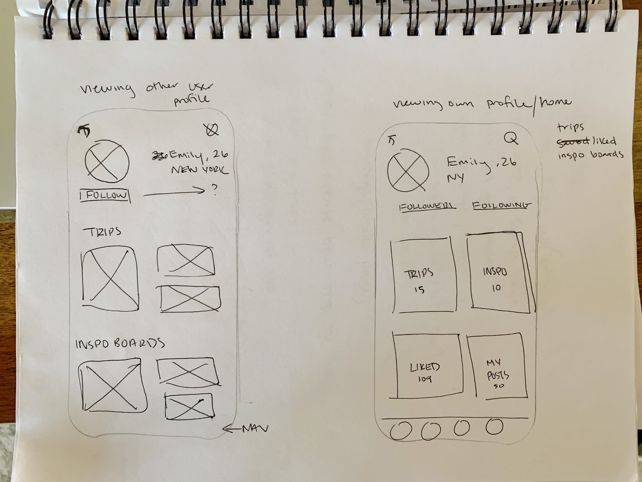
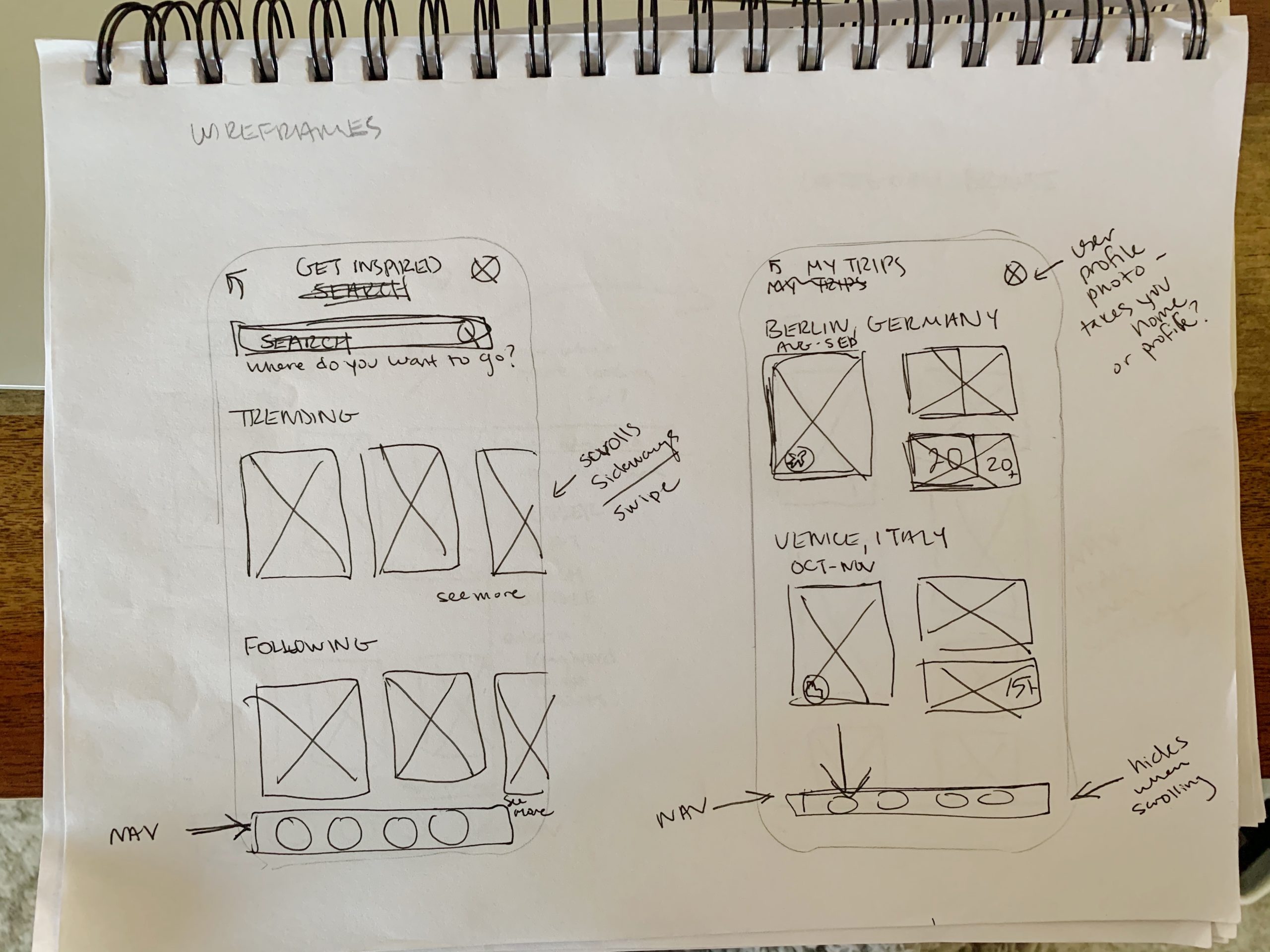
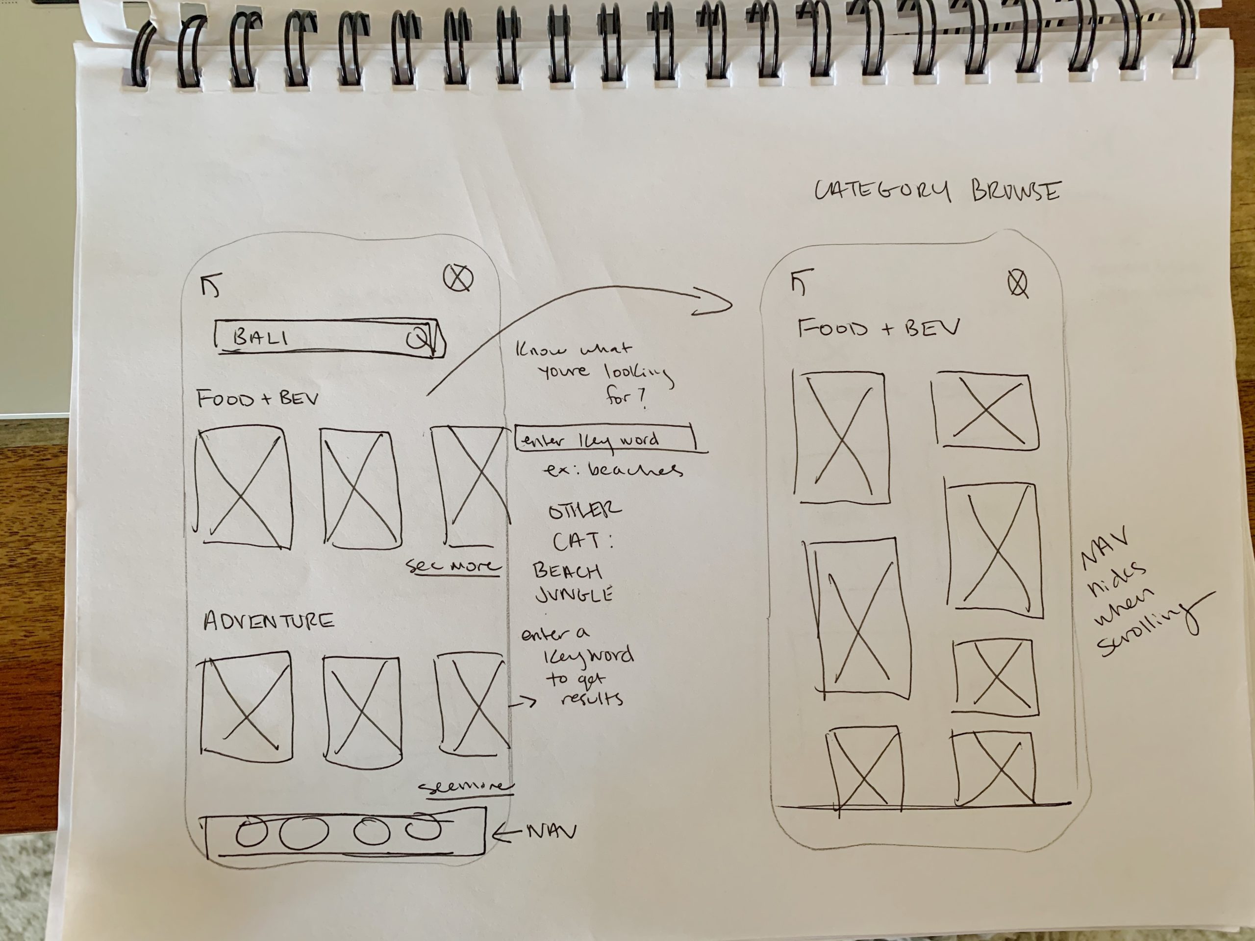
Once I had brainstormed the features of my app and was starting to get a sense of how this app was going to work, I made a user flow and with that started to sketch so I could start to see on paper how I was going to execute my ideas. I sketched A LOT before I was even close to something that seemed like the right direction. Since this wasn't an existing product and was a brand new concept, this part of my process was extremeley important.
Since my research showed me that photos are what inspire and motivate people to travel, I knew I wanted to have the app primarily consist of photos. The idea was that users could browse and search high quality photos based on key words and categories, create photo boards (similar to Pinterest), but to also be a planning tool. All photos uploaded to the platform would have to be approved and provide details and tips for that place so that users would be able to plan and build an itinerary. Users expressed that they often find things on social media that interest them but then have to do the extra work to find out the information. So I wanted to design my app to be all in one. A travel planning app that users would enjoy using the same way people enjoy using Instagram or Pinterest. A tool, designed to feel like a toy.
SKETCHING/INITIAL WIREFRAMES:
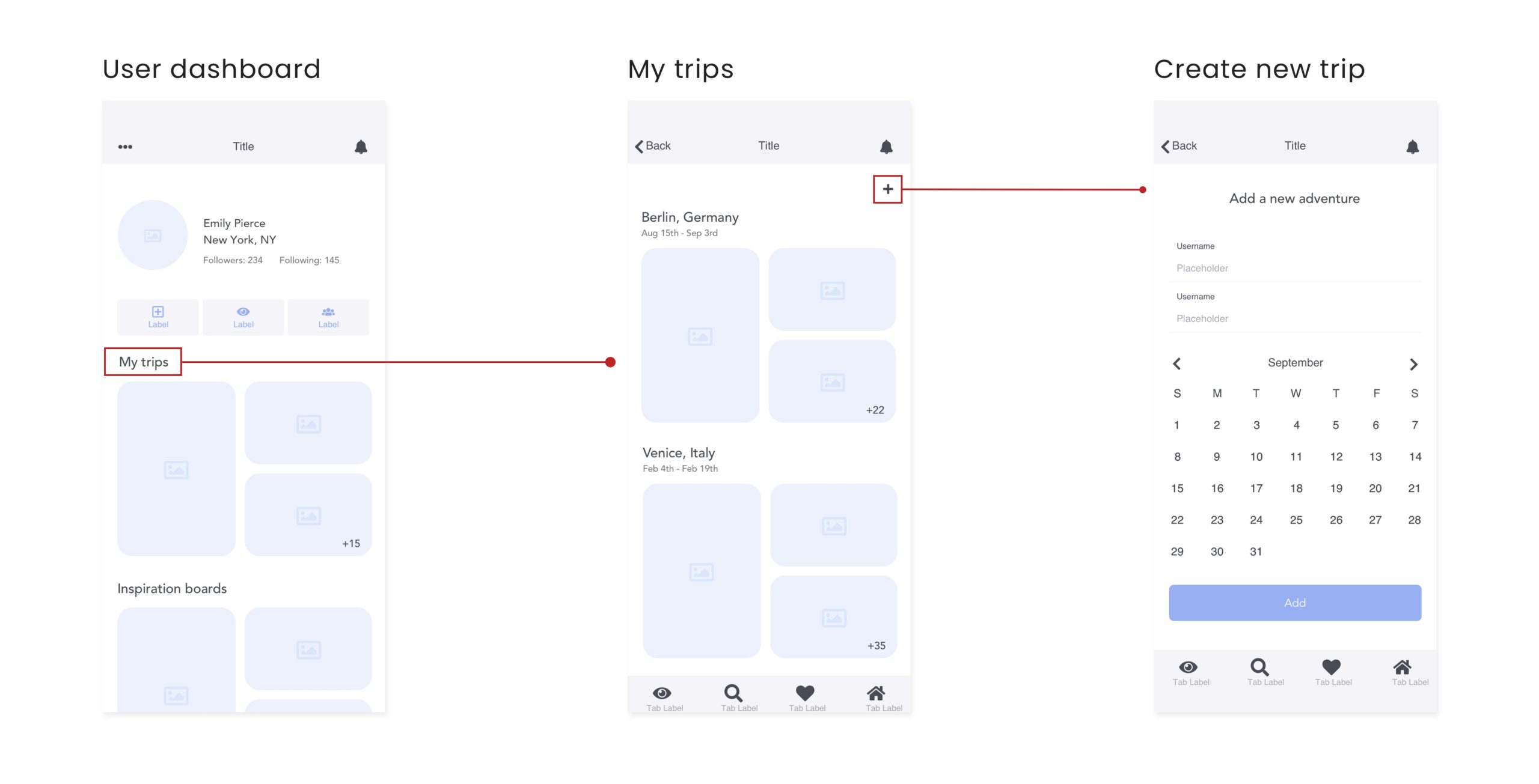
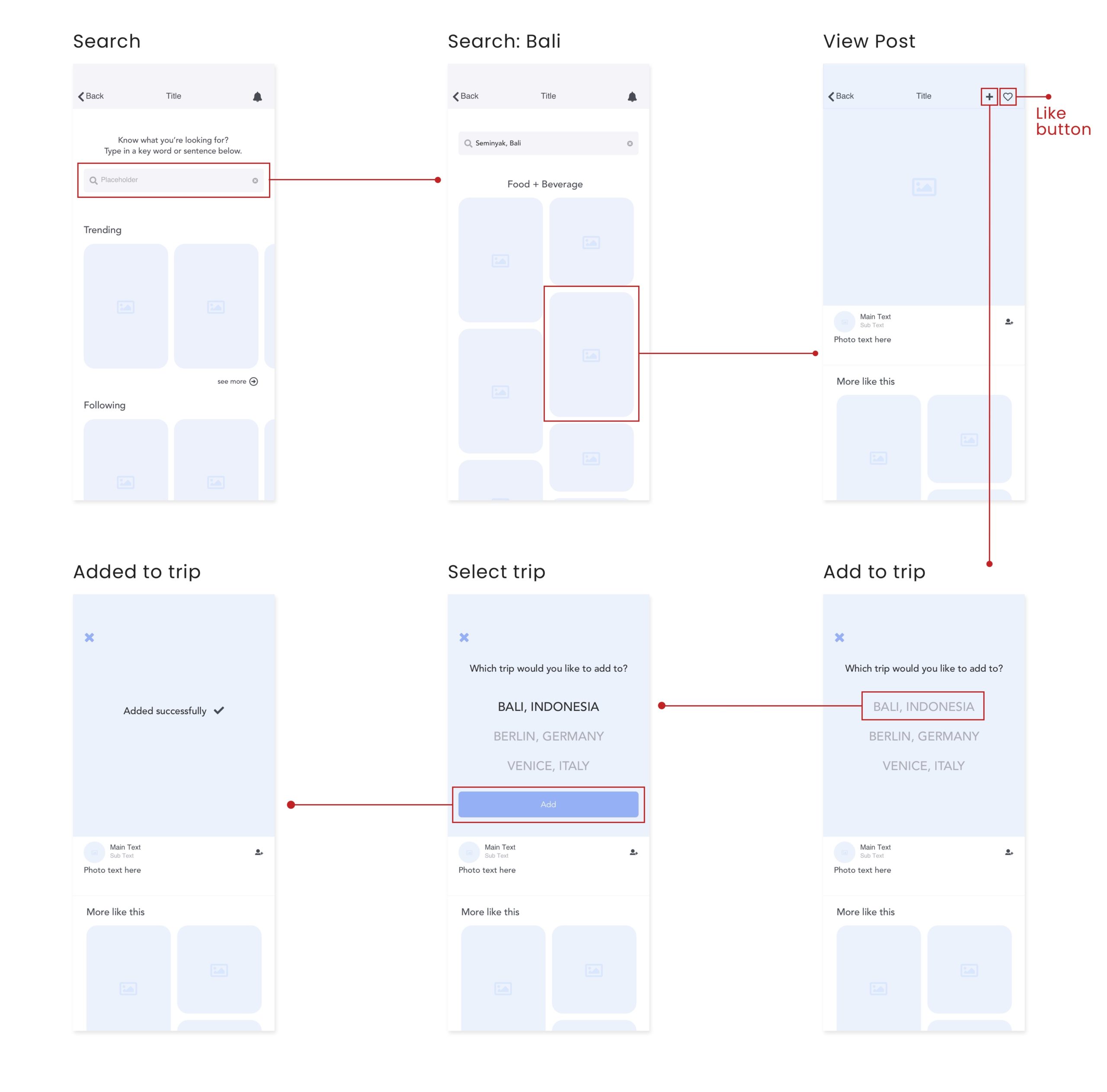
LO-FI & USER TESTING:
I conducted four usability tests on my LO-FI prototype. Although users really enjoyed the concept of the app, all users ended up getting stuck and having trouble with the two main flows of the app: creating a trip and adding/liking photos.
- Flow one, creating a trip: users couldn’t figure out how to create a new trip and got completely stuck. They didn’t think that “My Trips” was clickable and they were looking for a plus sign or some kind of add button. Some users even tried going to the search page to try and add a trip.
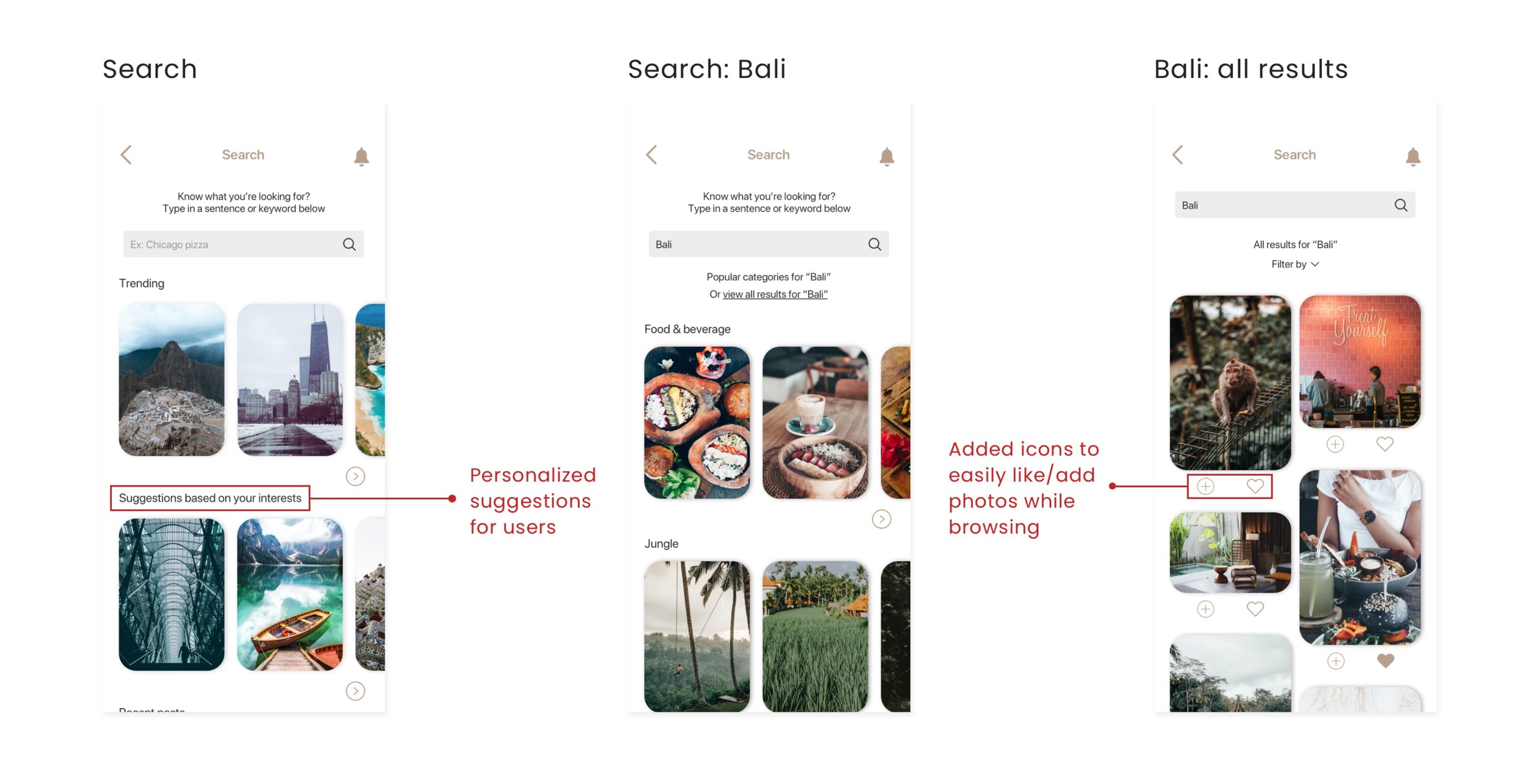
- Flow two, adding photos to trip + liking photos: users couldn't find the plus/add button right away. They said they expected to find it below the photo and didn't notice it at all at the top right corner. Also having it over the photo made it even less accessable. Once they knew where it was, they had no trouble completing the rest of the task. They had the same issue with the heart button for liking photos.
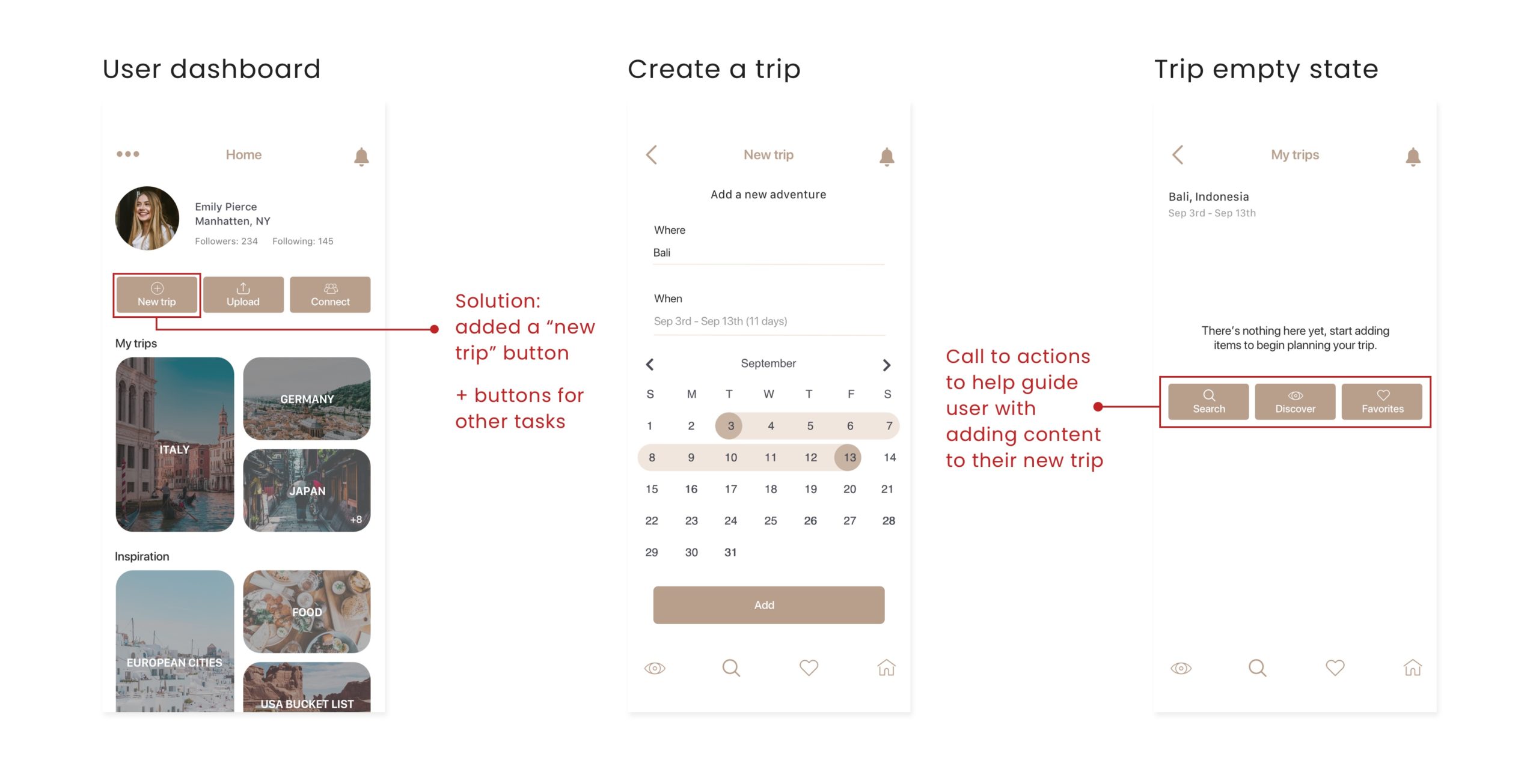
HI-FI Solutions
I took the user feedback I got from usability testing, brainstormed solutions and implemented it into my first iteration of high fidelity. Once I had my HI-FI prototype, I conducted guerilla testing on three participants to see if my solutions were successful.
GUERILLA TESTING INSIGHTS:
- Users were able to successfully get to the homepage
- Users were able to successfully create a new trip
- Two out of three users felt confused when adding a photo to their trip
- Two out of three users attempted to use the search page to find friends to follow and became stuck. One user was easily able to add a friend through connect
- Users were able to successfully logout
HI-FI round two
After doing the guerilla testing, I was inspired to take the UI in a whole new direction. Based on user feedback, I wanted to change the color palette and tone to make it feel more friendly, modern and trustworthy. Taking inspiration from IOS UI elements, I transitioned to a blue-green color palette, softened the interface with rounded buttons and corners, brainstormed new solutions and came up with my second iteration of high fidelity.
CREATING A NEW TRIP
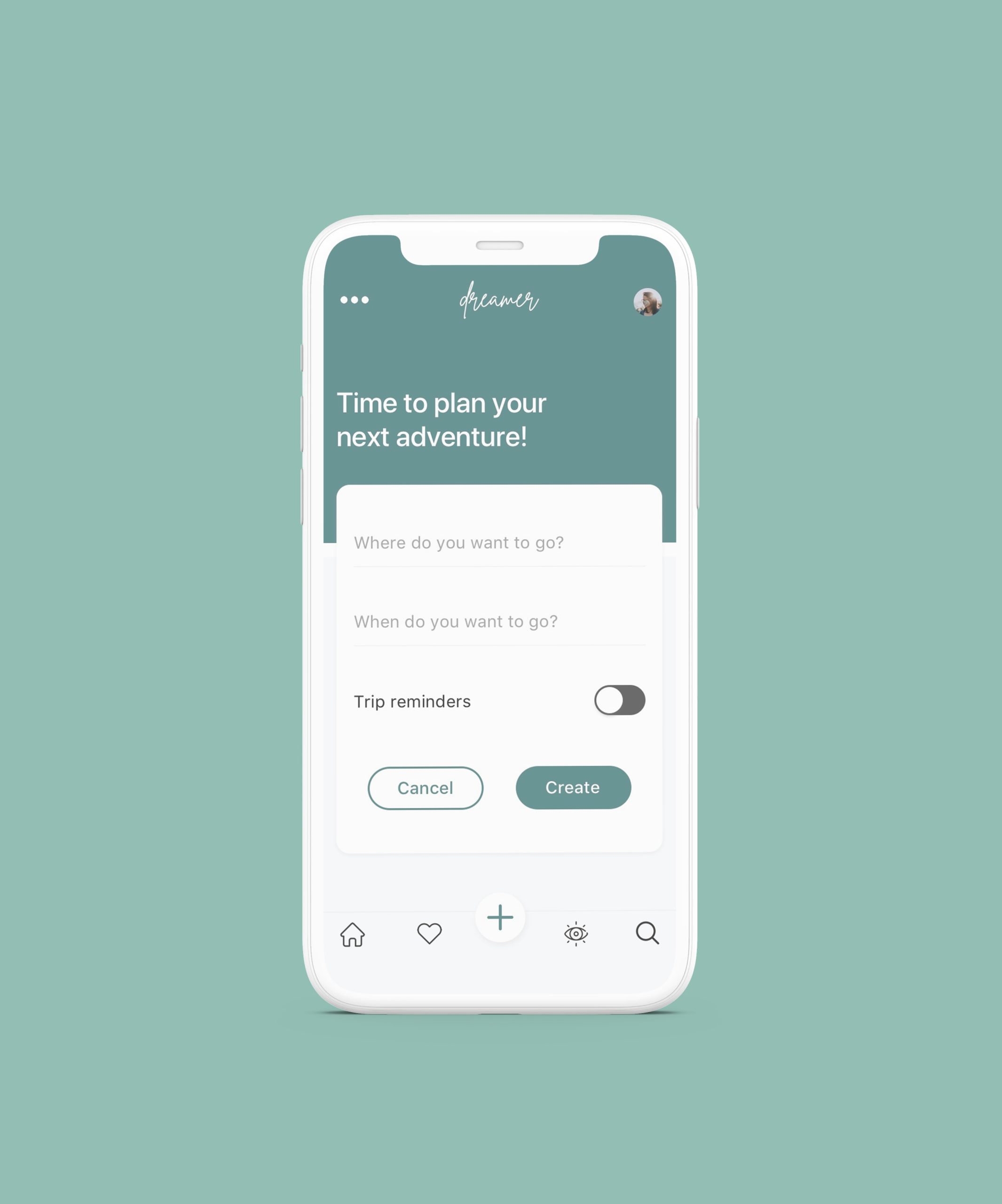
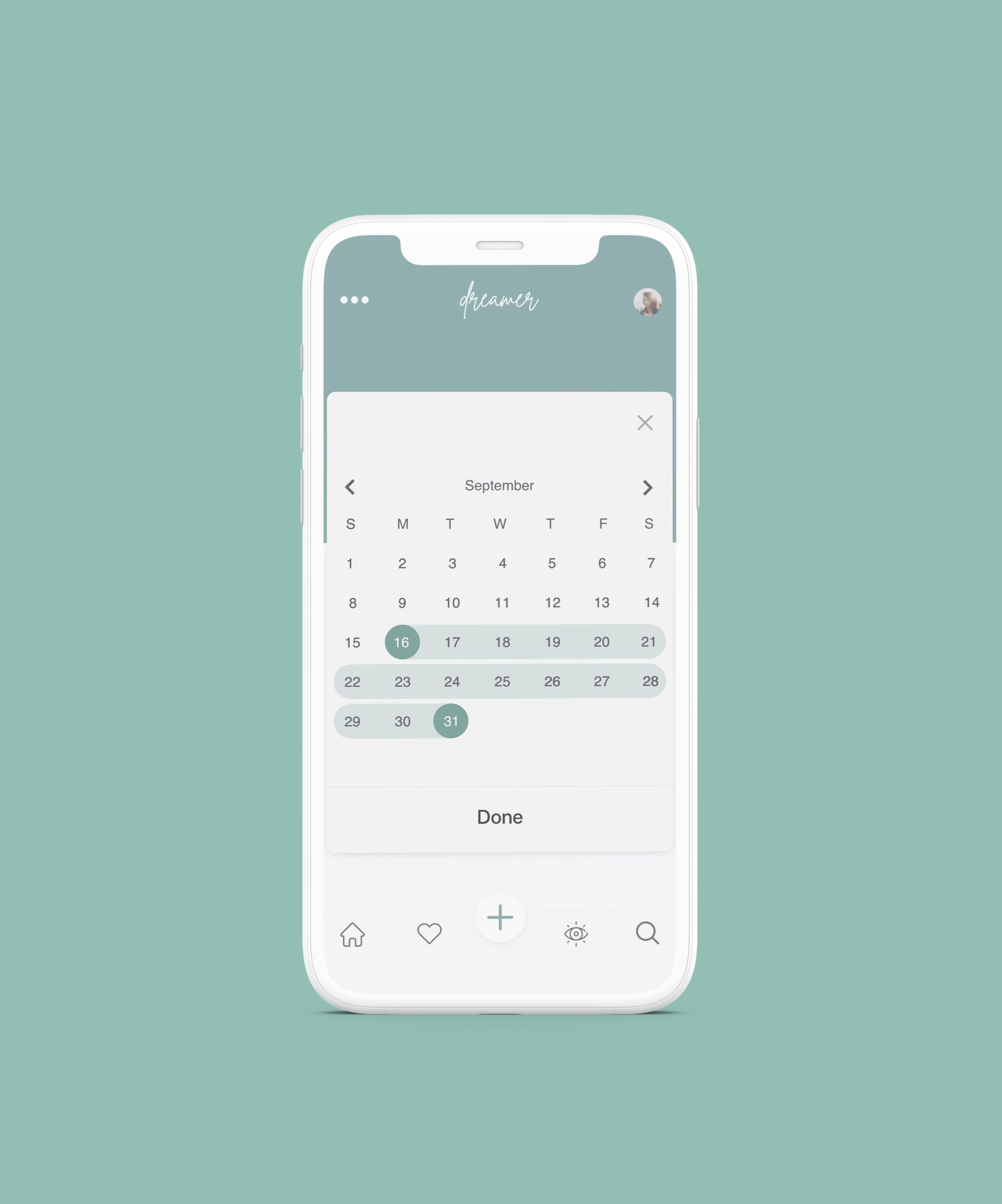
I discovered in testing that the previous calendar wasn't very intuitive. Users were confused whether to type in a date or click on the calendar. I also added a feature that allowed users to turn on reminders for their trip.
SEARCH & DISCOVER
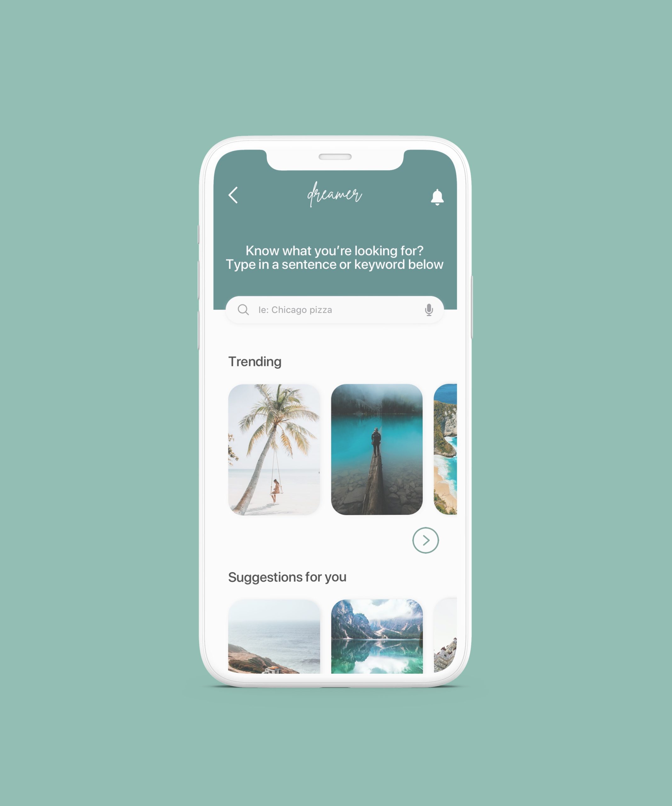
Users didn't have trouble using the search page, so not much changed here. However, the idea of combining the browse and search page is something that came to mind and something I might test. It might not be necessary to have both, and users often asked what the difference was between the two.
CALENDAR OVERLAY
To solve this, I removed the calendar on this screen and turned it into an overlay that pops up when you click on "when do you want to go", prompting the user to select their dates. When the user is finished they can select "done" and the dates will be filled in for them.
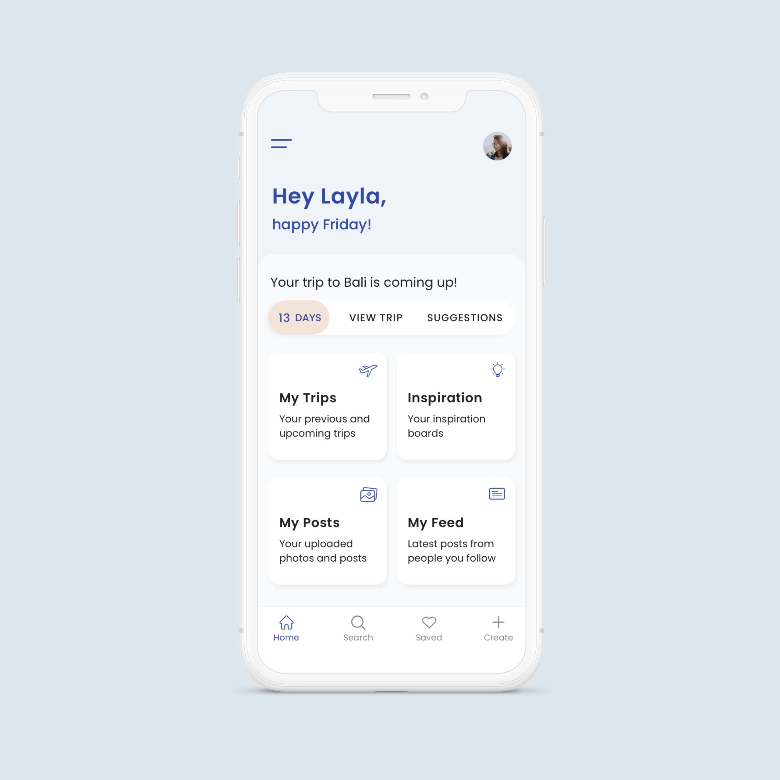
UPDATED DASHBOARD
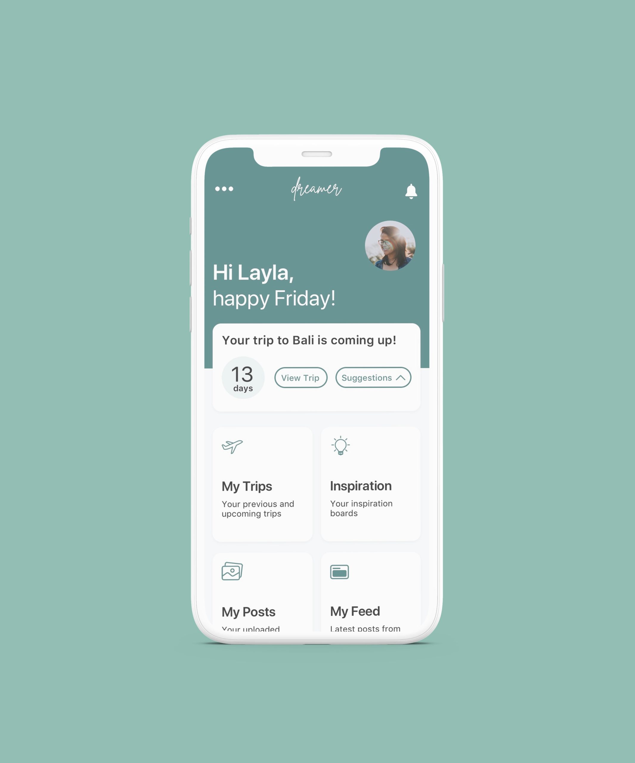
Redesigned the dashboard to feel more clean and personalized. Added trip reminders with call to actions to help assist users with planning. If the user doesn't have any trips planned, it would display suggestions or something on their bucket list.
UI update
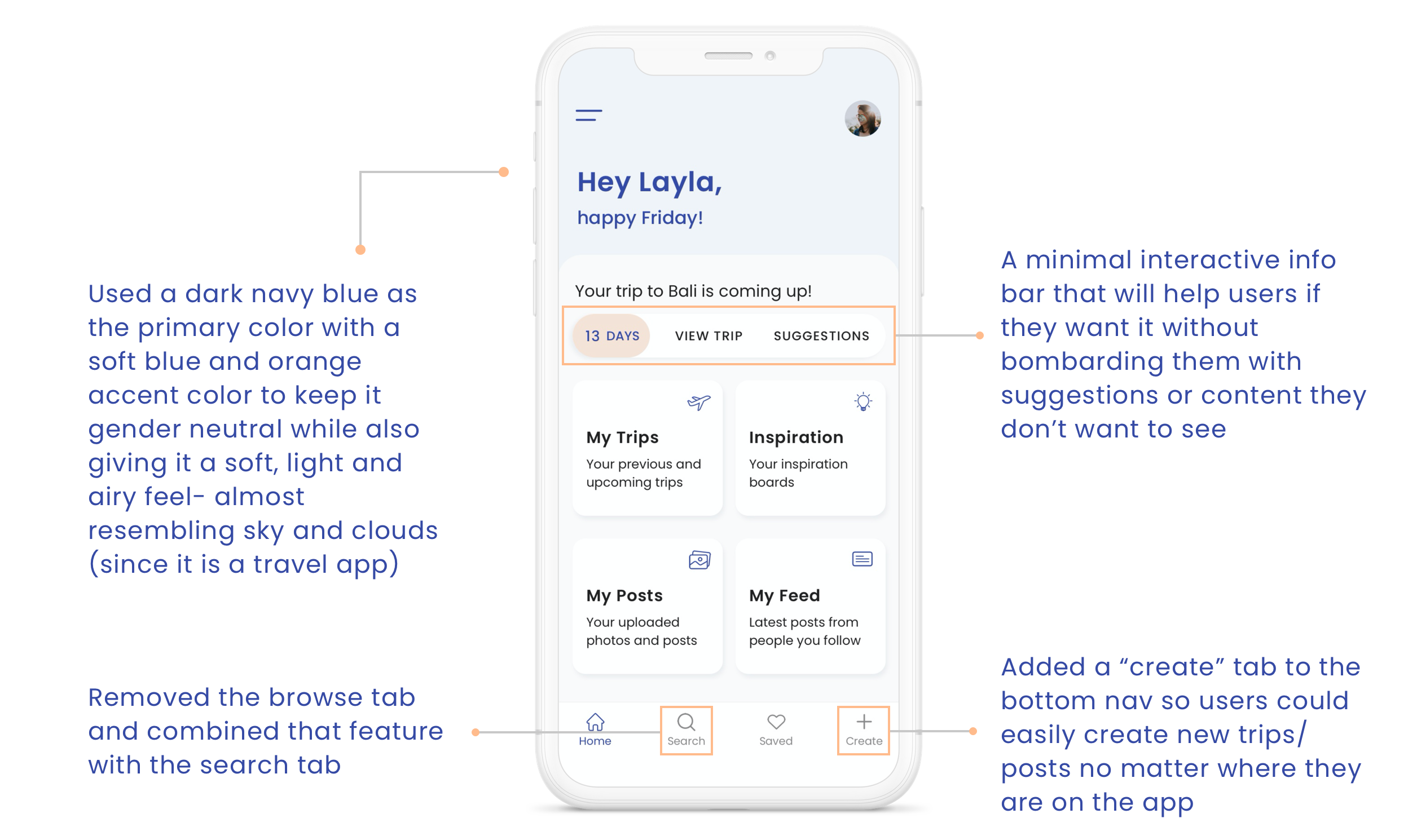
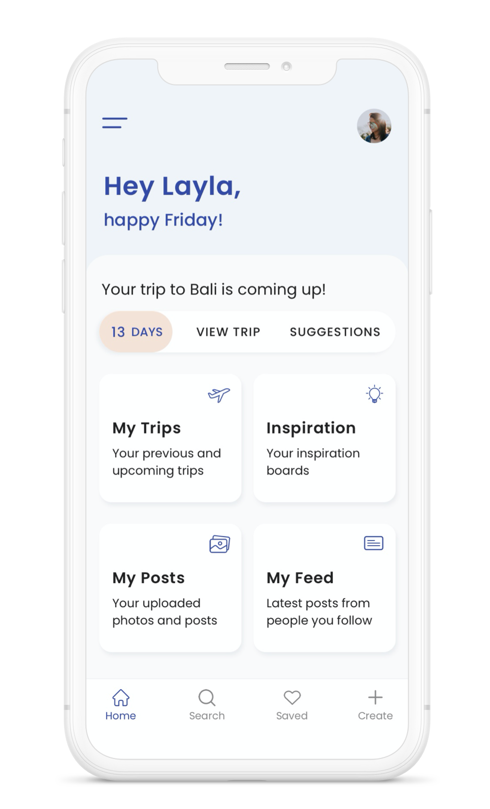
I'm currently working on my third iteration of the UI for this app. The biggest reason for this is that I started this project at the beginning of my design bootcamp and although I'm still just as passionate about the concept of this app, I have grown a lot as a designer since then. And I wanted to implement that growth into this app. The other reason being that I am still working through solutions and continuously trying to make this app more clean and intuitive. Once I implement the rest of the UI changes, I will conduct user testing to make sure my solutions and aesthetic is going in the right direction and to see if users prefer the new changes.
Final Thoughts
& Next Steps
I learned so much from doing this project not only because it was early on in my UX education but because this was an individual project without a team, creating a concept from scratch. It was extremely challenging at times having to practice bouncing off my own ideas and I found myself starting over a lot. I wasn't able to lean on a team for ideas or brainstorming so it really forced me to push my design thinking and problem solving thought process. This project is still ongoing for me; I am now on my fourth iteration of the UI but am passionate about this concept and am excited to continue working on this design.
I'm still working through solutions for this app and would love to one day see this concept as a real product. Here are some of the next steps I plan to take:
- Update the rest of the UI
- Conduct user testing on the new UI/most recent solutions
- Build more screens (messaging, discover, finding/following new people, inspiration & trip boards)
- Design desktop
Thanks for reading!
